Contemporary Muslim Fashions
Visual Identity, Exhibition, Architecture
Architecture and graphic design for the first major museum exhibition on modest fashion at Cooper Hewitt, Smithsonian Design Museum
Creating a Shared Sense of Community
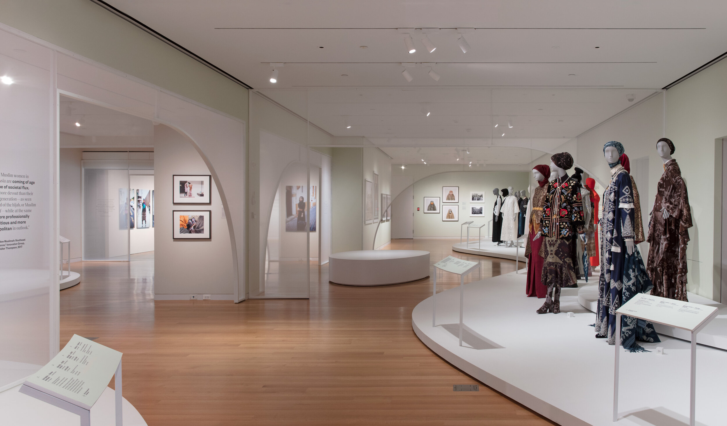
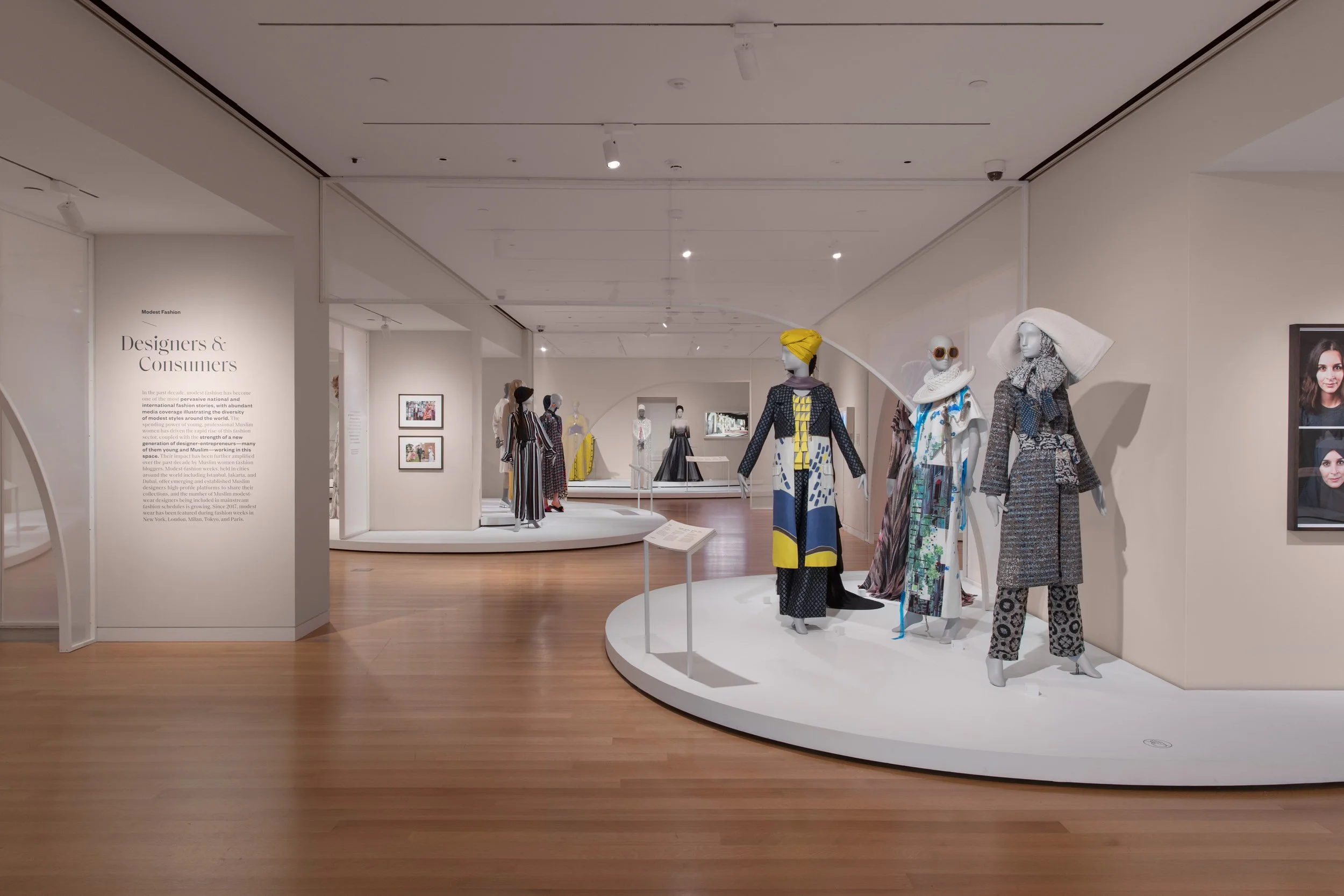
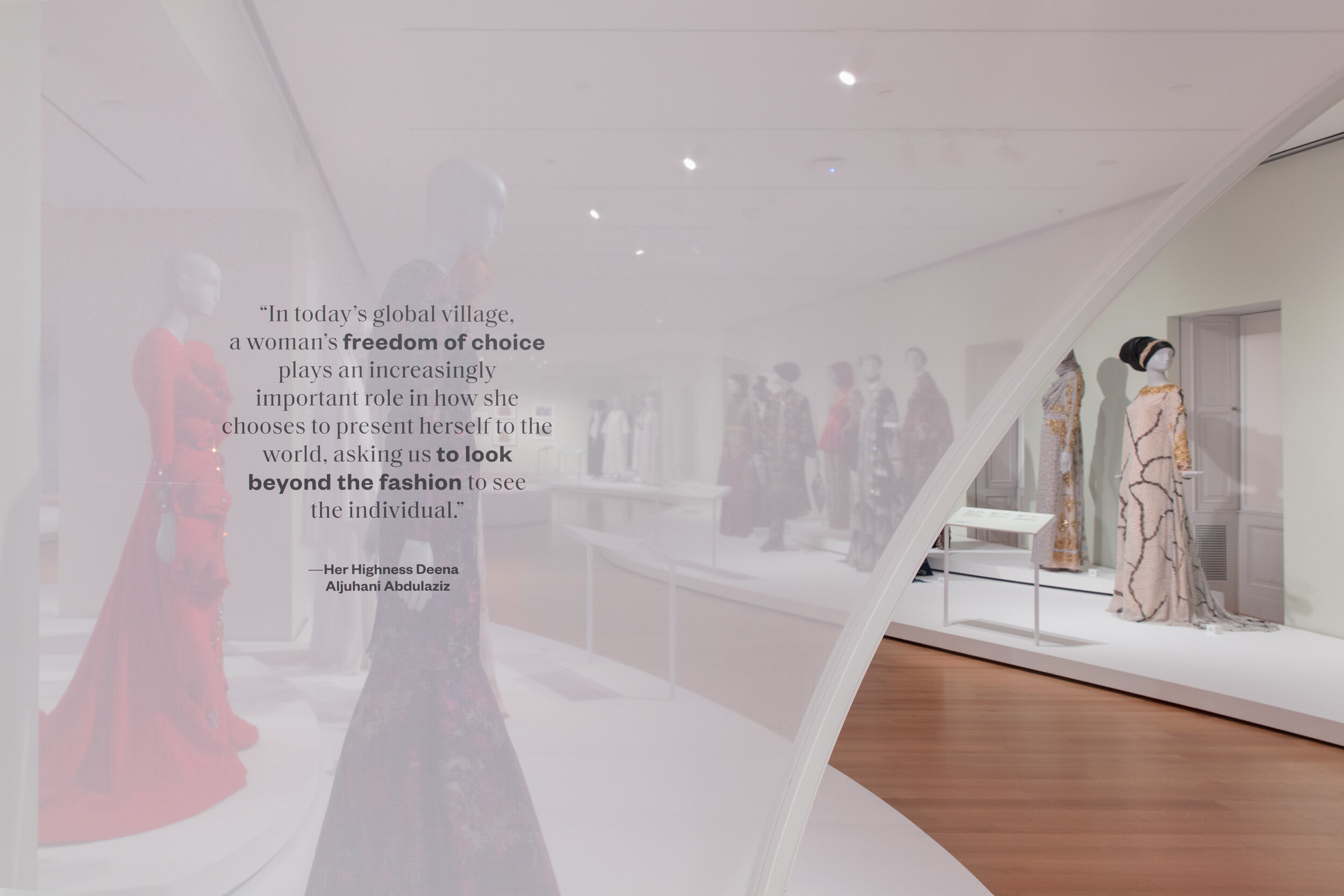
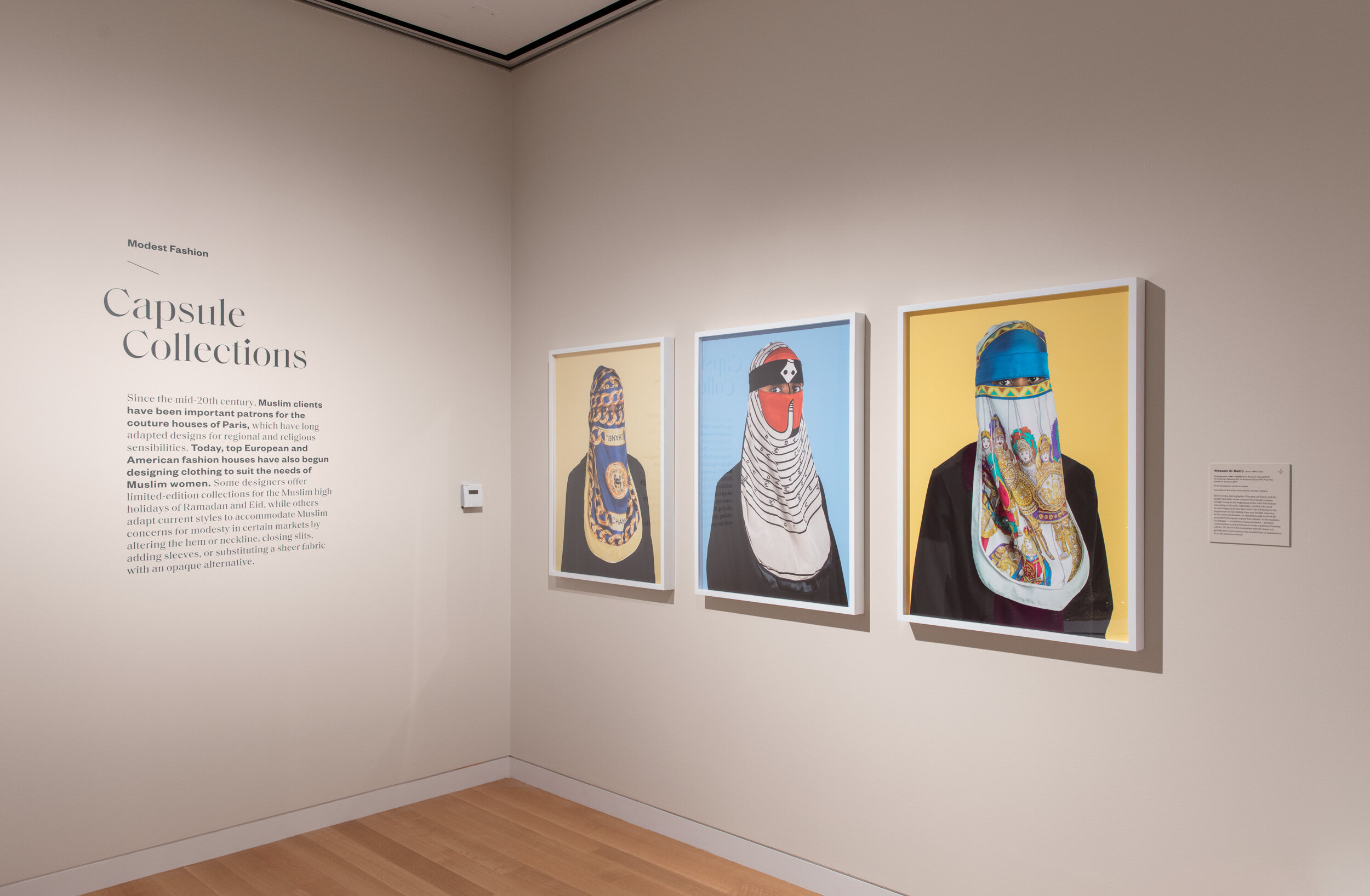
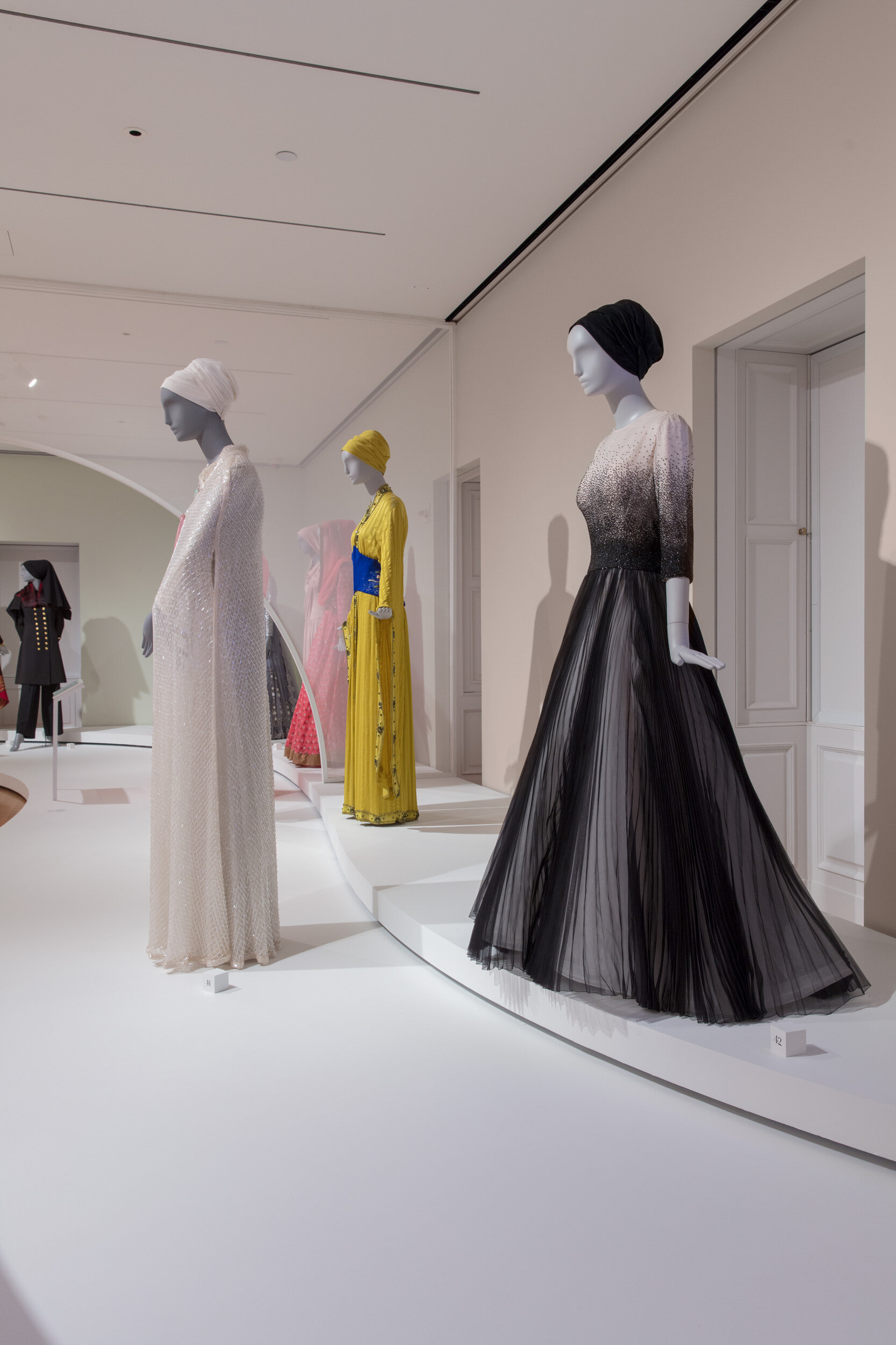
Foregrounding an ethos of dignity and personal agency, this 6,275 sq. ft. exhibition at the Cooper Hewitt, Smithsonian Design Museum features contemporary innovations in international modest fashion—including 80+ ensembles, alongside prints and videos. The exhibition was originally curated by and presented at the de Young Museum in San Francisco, and the Cooper Hewitt presentation required sophisticated design to re-present the same objects in a space half the size. Isometric designed a refined yet edgy visual identity that bridges exquisite couture pieces from European designers with street fashion and feminist artworks. The exhibit architecture is inspired by the plan of the Córdoba Mosque in Spain, using translucent half-arches to subdivide the museum’s largest gallery into intimate, thematic rooms. Along with sweeping curvilinear platforms and minimalist custom labels, the architecture democratizes the space and evokes a shared sense of community.
Photos: Matt Flynn © Cooper Hewitt, Smithsonian Design Museum
Exhibition fabrication and installation by New Project.

Addressing Social Issues with Nuance
The exhibit features mannequins with covered heads and without, and this often-controversial topic is discussed with nuance and candor. It also features several works that critique Islam’s restrictions on women, demanding equal treatment in public and private spaces. With the translucent arches, we wanted to evoke a sense of serenity and respect, yet also hint at ideas of desire and discovery that result from partial veiling. The design refrains from imposing moral order and judgment, allowing visitors to think on the topics presented and decide for themselves.
“The design exactly fulfills my desires. It is visually clean in every detail, the experience of being in the galleries is easeful, the graphics are well-integrated and clear, the architecture is compelling without drawing focus away from the objects, and most importantly, you can really see the objects.”
An invitation to engage and learn
As the original curators from the de Young Museum required a 3-foot touch distance, the platforms took up an enormous amount of square footage. In the end, it was a small miracle that 80 mannequins were accommodated without overcrowding the gallery. We wanted to ensure that the mannequins did not feel like an army unit regimented in a grid. Instead, we created intimate compositions of gathering, so that visitors might feel like they are entering a welcoming community.

