Bin Bin Sake
Visual Identity, Signage, Illustration
Visual identity and storefront graphics for sake pop-up by Rule of Thirds in Greenpoint, Brooklyn
Sharing Japanese culture and building community
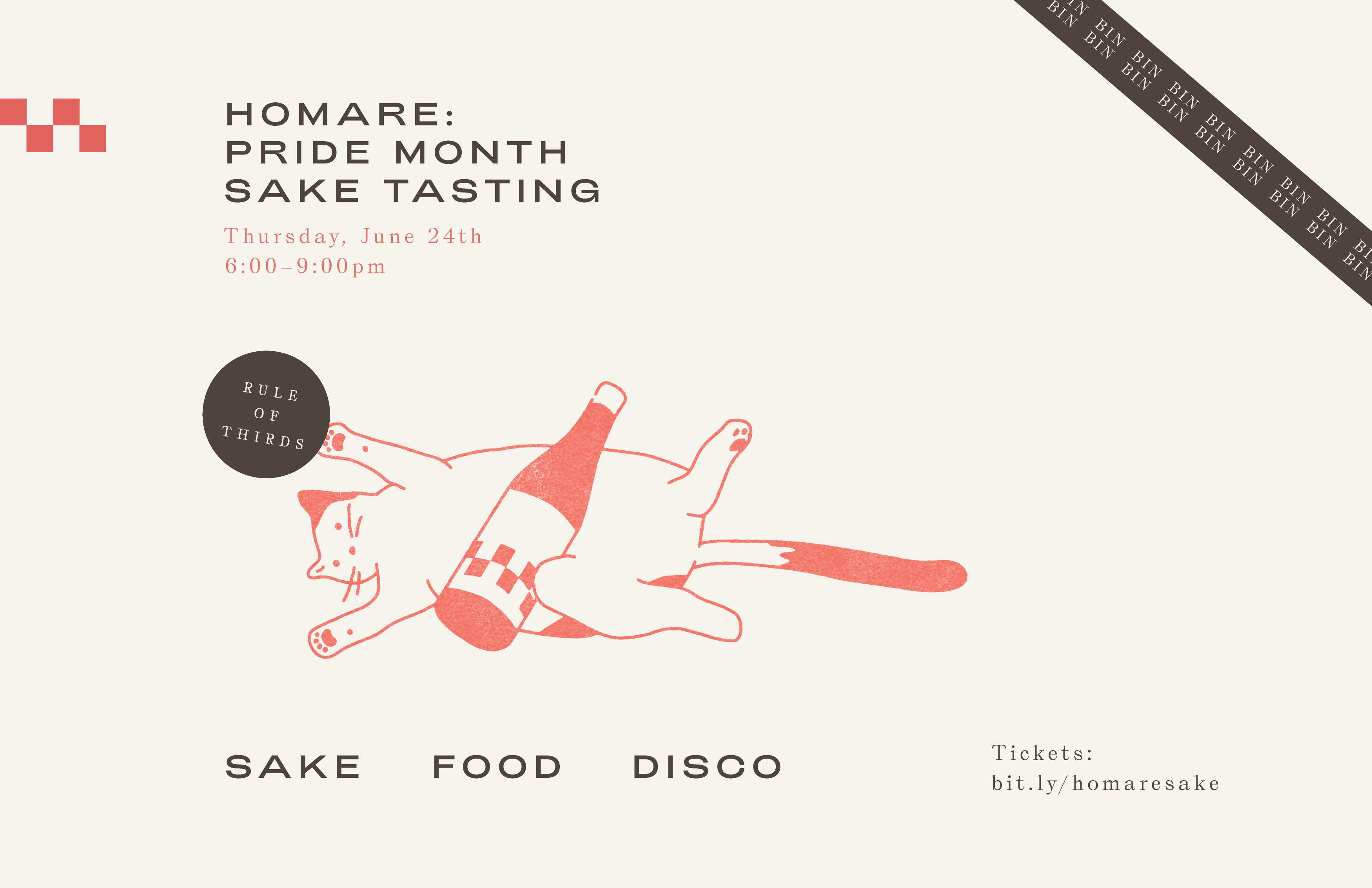
Following the success of the beloved Rule of Thirds restaurant by Sunday Hospitality, co-founder George Padilla decided to pursue his passion of sharing the magic of sake with everyone he encounters. This complex and exquisite drink takes time and effort to fully appreciate and enjoy. As the previous A/D/O design space had closed in the pandemic, there was a vacant location available adjacent to the restaurant, so George asked Isometric to give the project and the storefront a joyful and bold identity to signal a rejuvenating spirit and a welcoming gesture. The resulting design features a cat character named Bin Bin, which expands the Rule of Thirds identity to humorous effect.
Mural painting by Noble Signs.
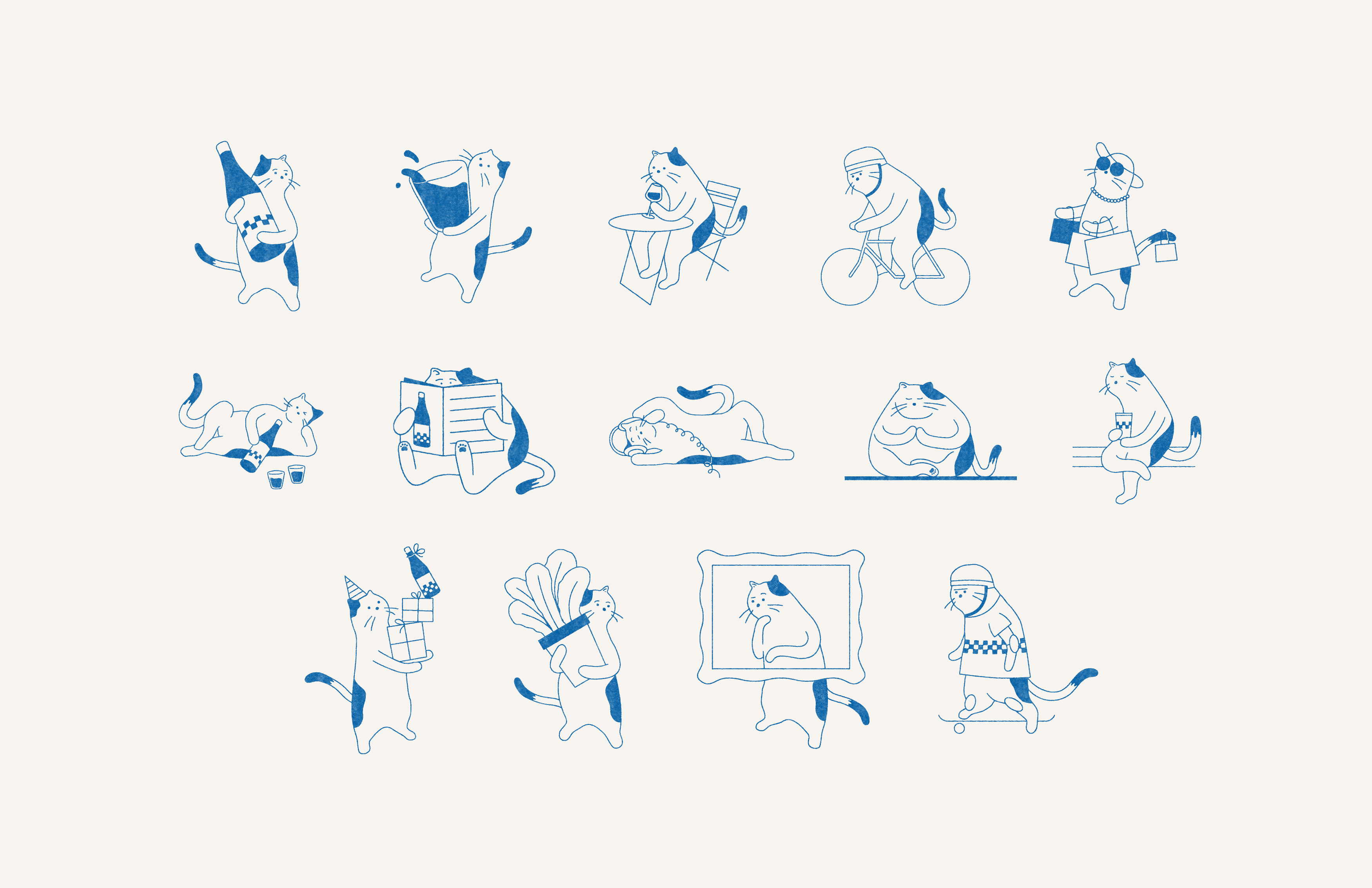
Photo by Eric Medsker.
Expanding a celebrated brand identity
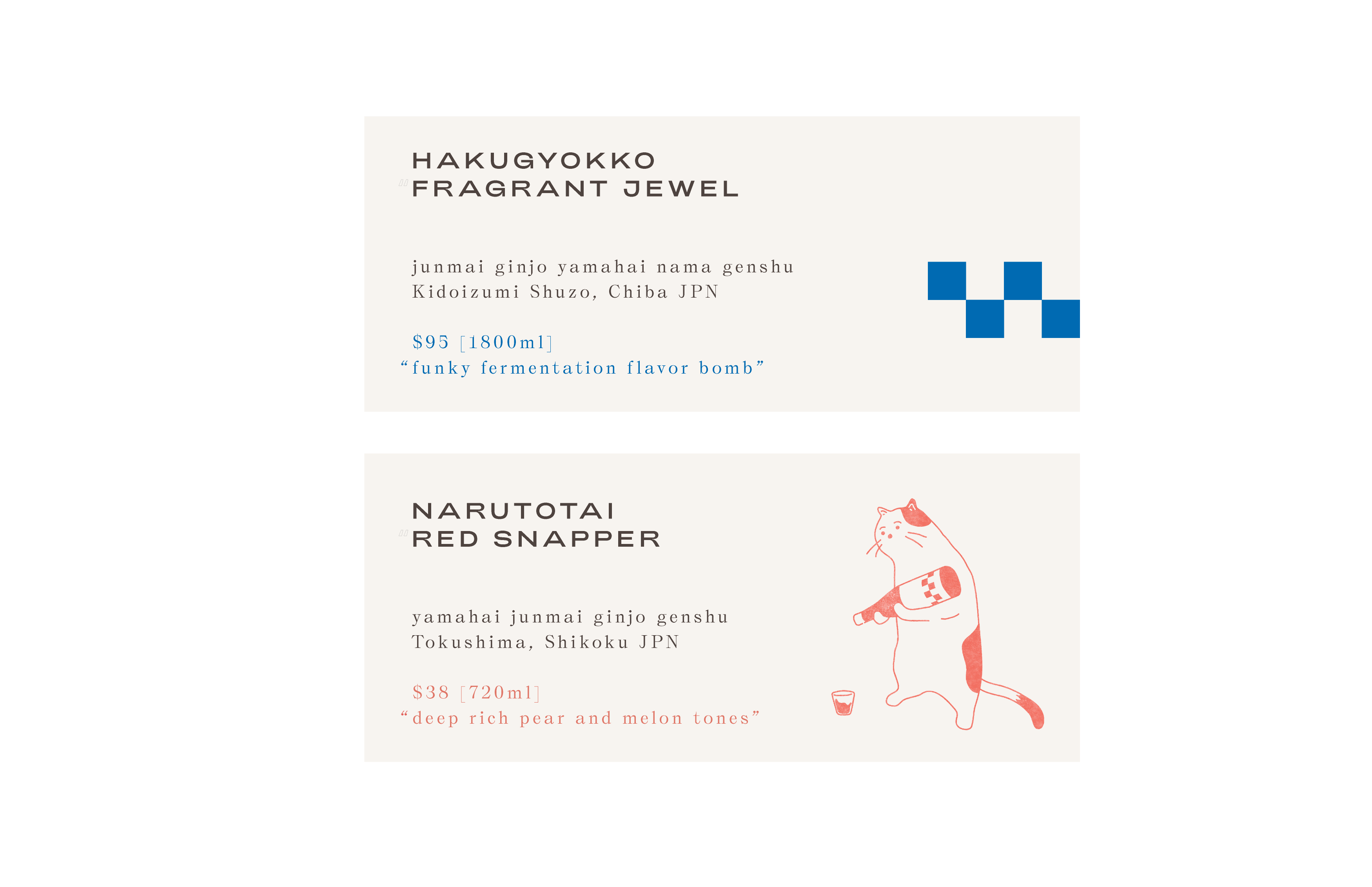
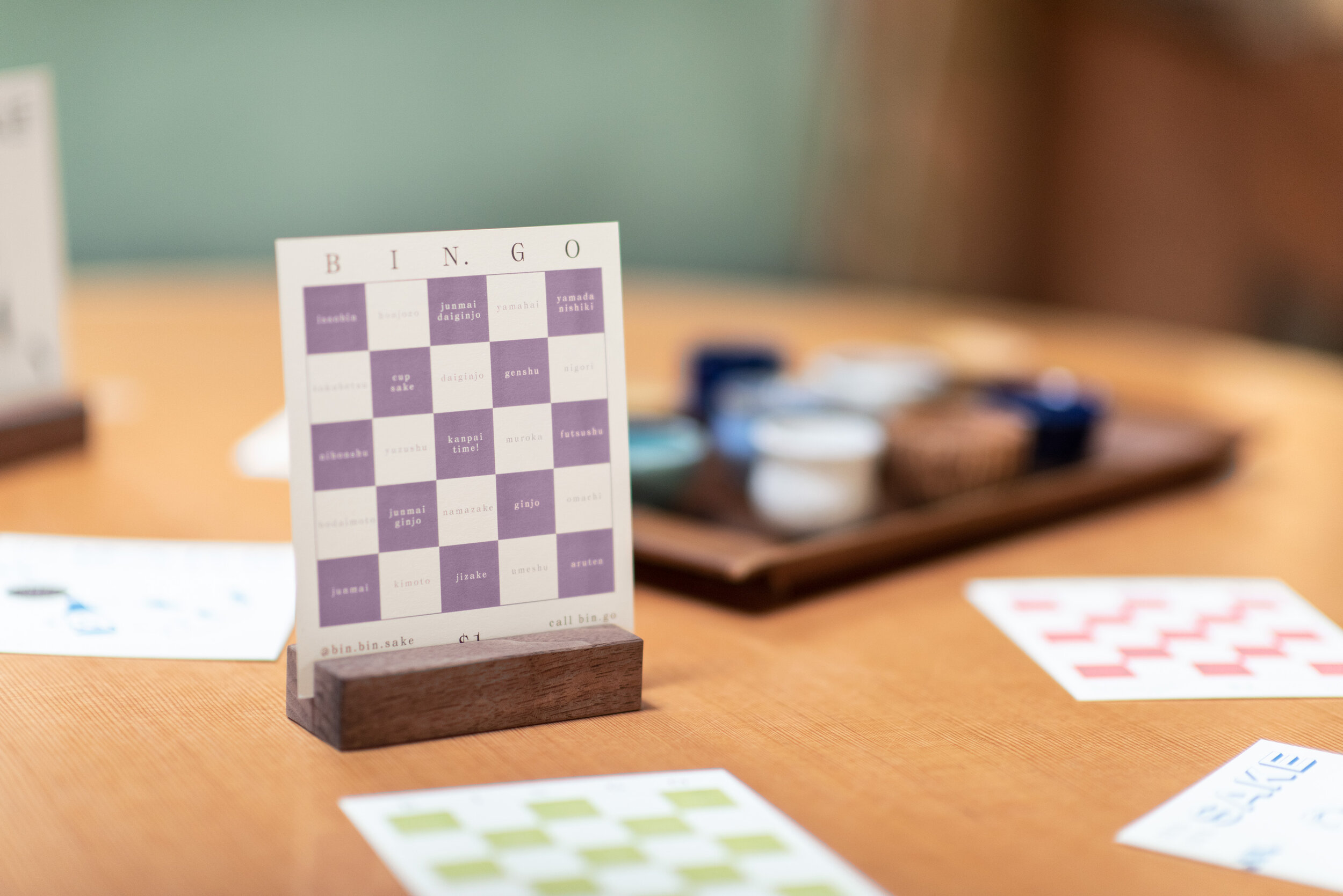
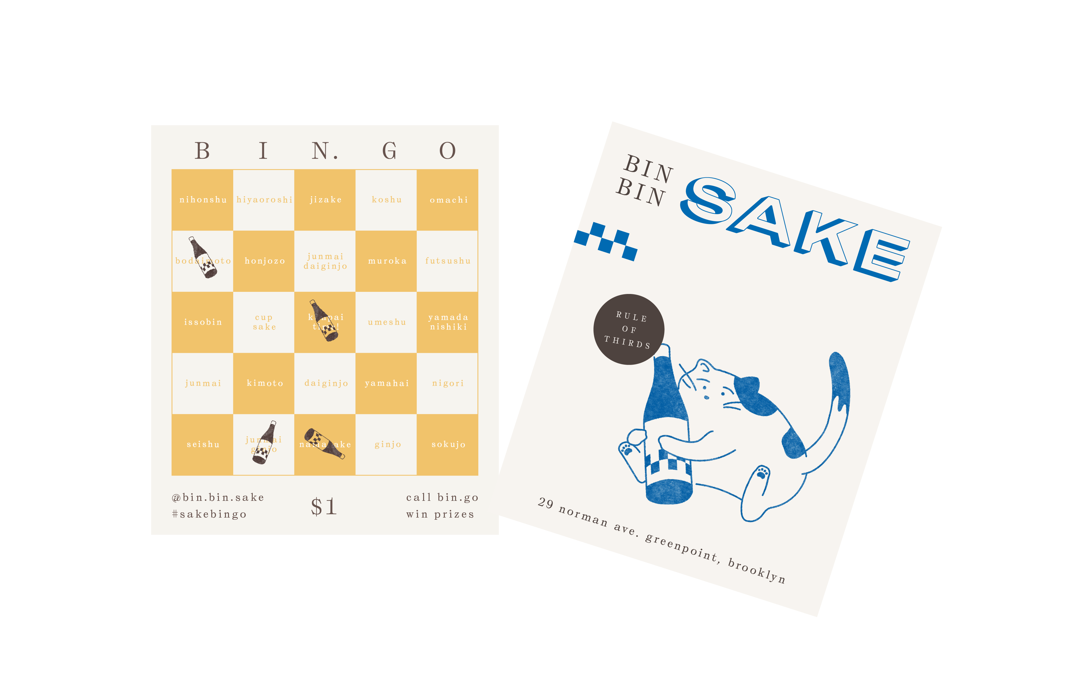
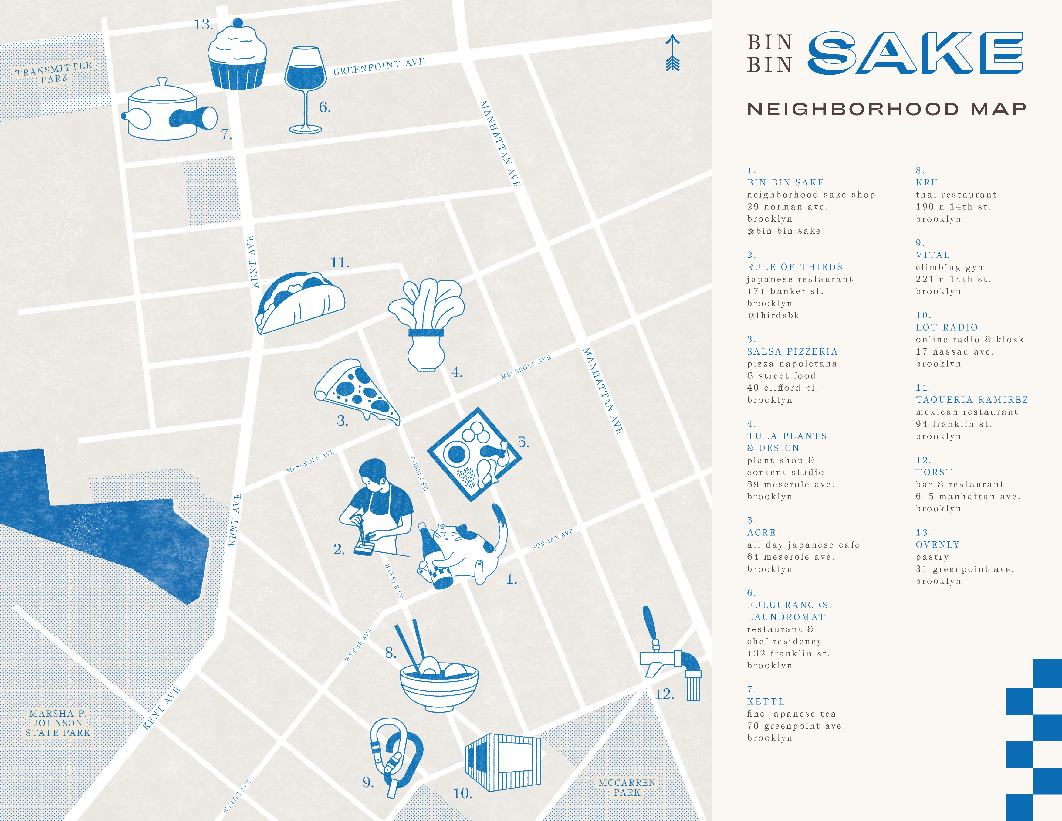
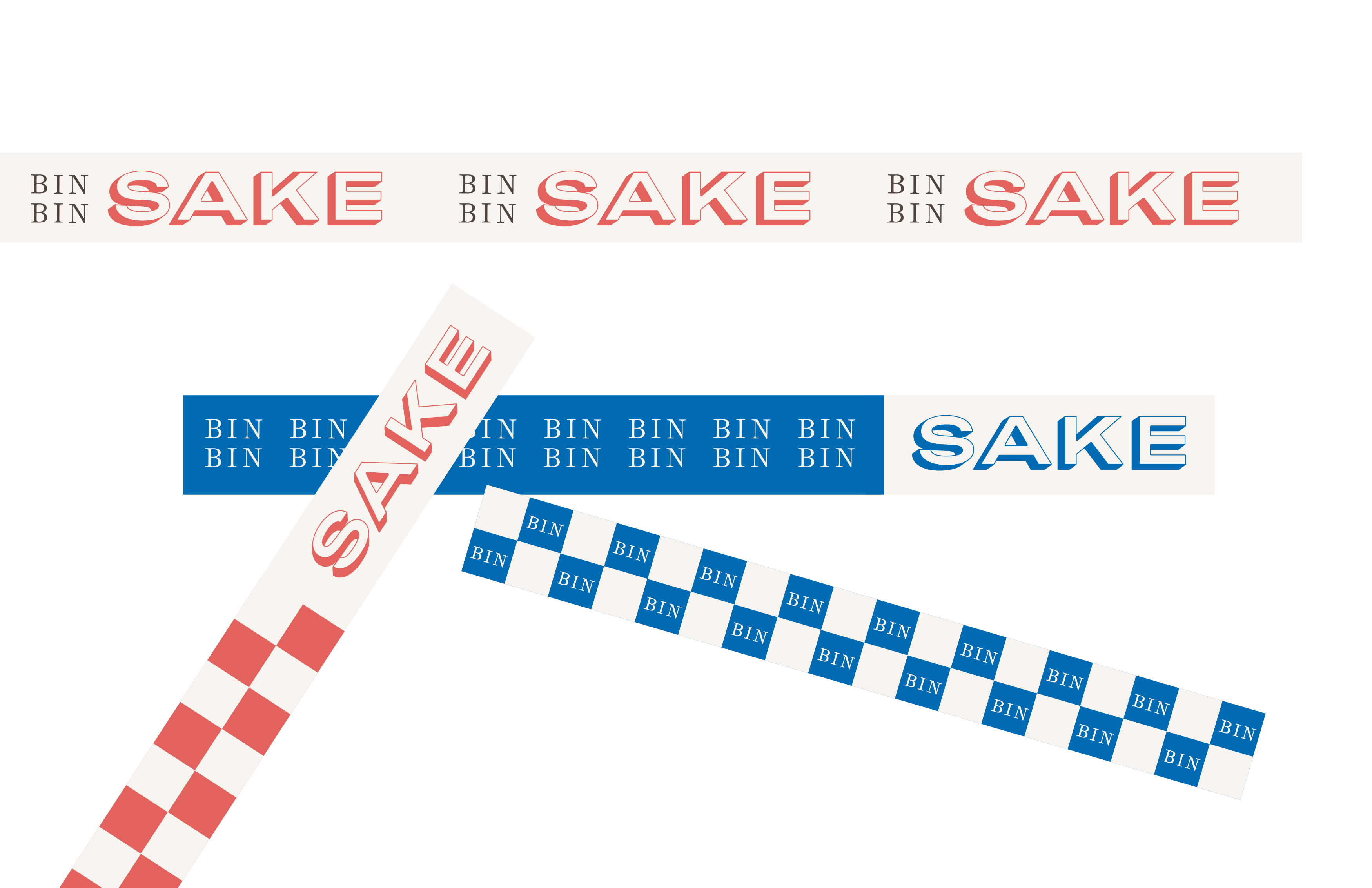
The visual identity builds on the Rule of Thirds visual identity, borrowing its primary typeface and treating it as a secondary type style. It adds a customized, extended sans serif font, an expanded color palette, and a checker pattern—inspired by Japanese sake packaging motifs—to infuse the brand with added vitality and specificity. It also features a new and delightful illustrated character: Bin Bin the cat, who enjoys drinking and serving sake. “Bin” is Japanese for “bottle,” which features both in the illustrations and in the title of a “bin”-go game where visitors can win fun prizes.
