We Flourish Conference
Visual Identity, Exhibition
Identity and conference materials for Princeton’s historic first conference for Asian and Asian American alumni

A Sense of Belonging
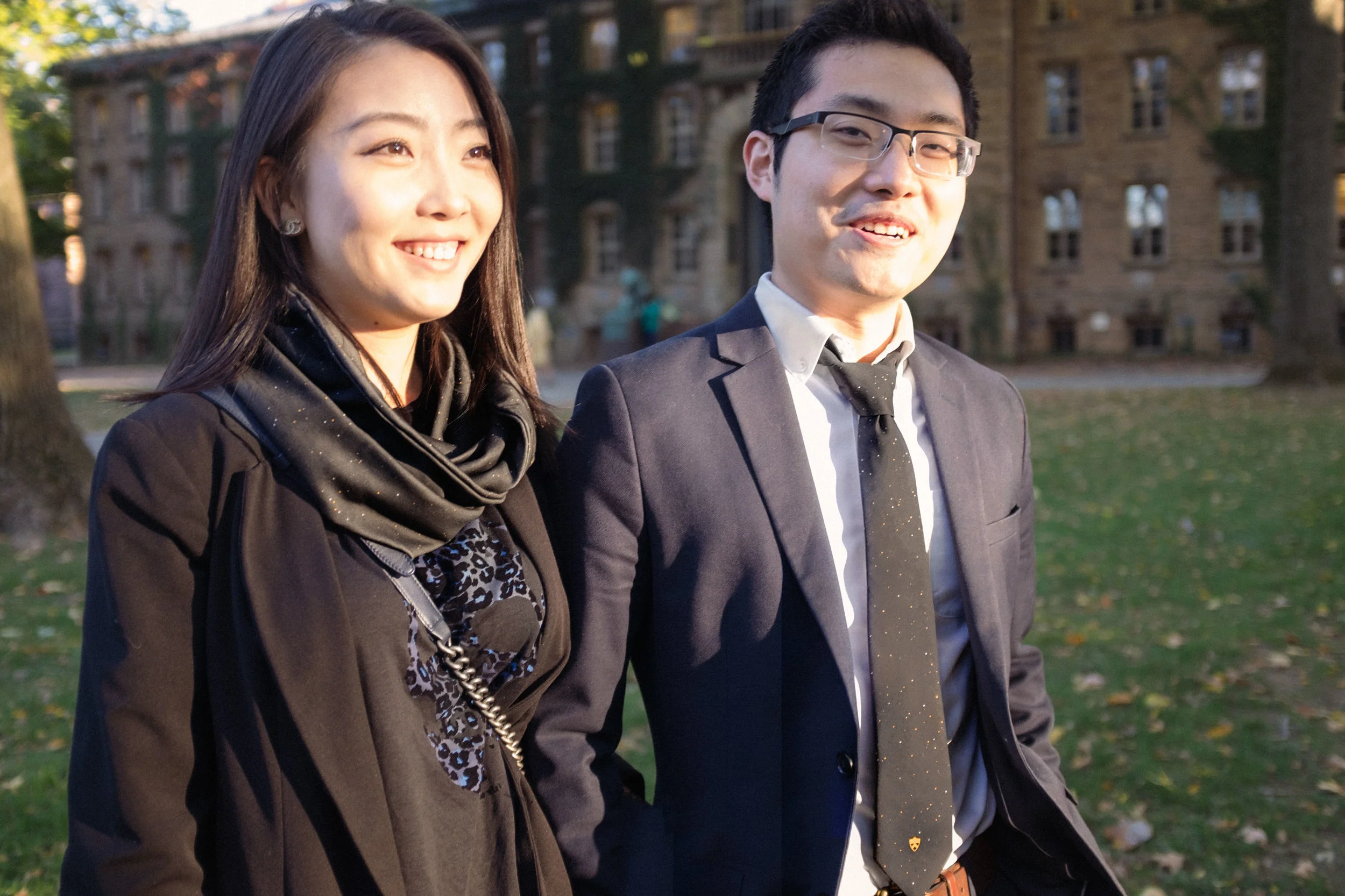
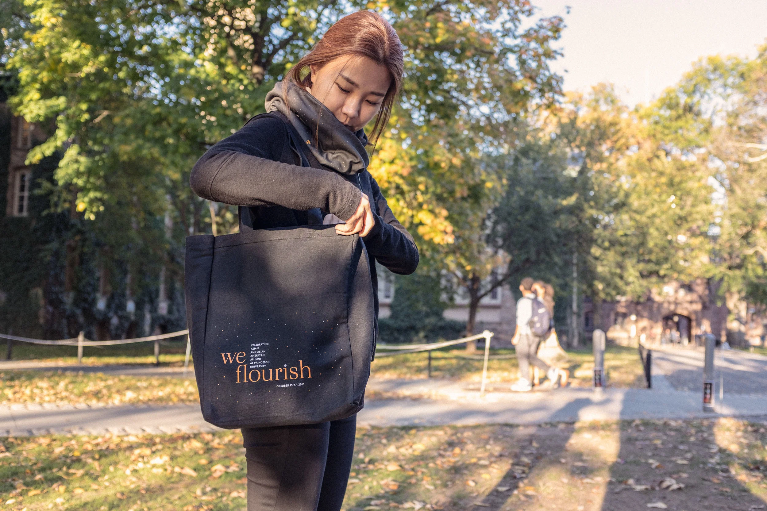
“We Flourish” was Princeton’s historic first conference for Asian and Asian American alumni. In designing its visual identity, we uncovered and challenged two prevalent stereotypes: that all Asians are foreigners and that they are all the same. Quoting the University’s official motto, we named the conference “We Flourish” to suggest the power of collective advocacy, as well as belonging at Princeton. We created a celebratory brand that depicts the community as a constellation, highlighting the achievements of Asian and Asian American individuals and of the community as a whole.


A seamless visual system
In previous alumni conferences, a single logo or pattern would be applied to all materials in a repetitive fashion. This resulted in souvenirs and programs that looked monotonous and generic. By applying a distinctive and flexible visual kit of parts at different scales and adapting it to different mediums, the design lended the conference a sense of celebration and prestige.