Johnson Museum of Art
Visual Identity, Website, Publications
Visual identity and website for the renowned art museum at Cornell University
Expanding access to a preeminent art museum
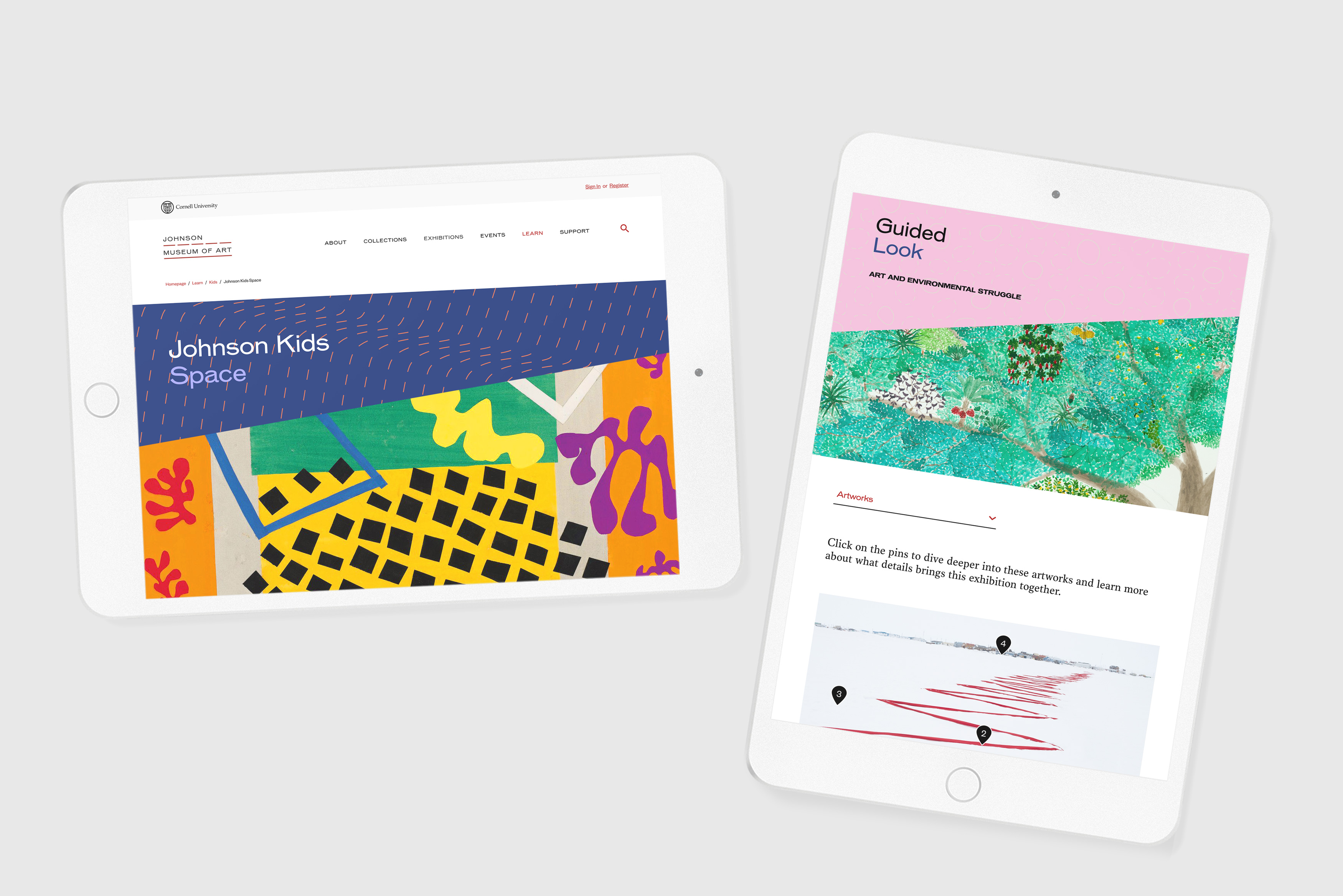
Isometric designed a wide-ranging new visual identity and website for the Johnson Museum of Art at Cornell University. Coinciding with the 50th anniversary of the beloved museum, the new design celebrates its architecture by I.M. Pei, abstracting its iconic ribbon window into a simple, dashed line motif—signifying the view from the museum onto the picturesque landscape of Ithaca and its role in interpreting the world beyond. The dashed line is a flexible yet memorable device that frames images, animations, and text. The new website is a transformative online platform that gives visitors unprecedented access to the Johnson’s astounding collection of 40,000 works that span six millenia and most world cultures. Beyond serving as a crucial archive, the website also acts as a dynamic educational platform. The Johnson Kids portal offers a variety of activities for children, and the Community Exhibition Creator lets visitors create their own online exhibitions incorporating artworks from the museum’s collection.
From iconic architecture to integrated visual system
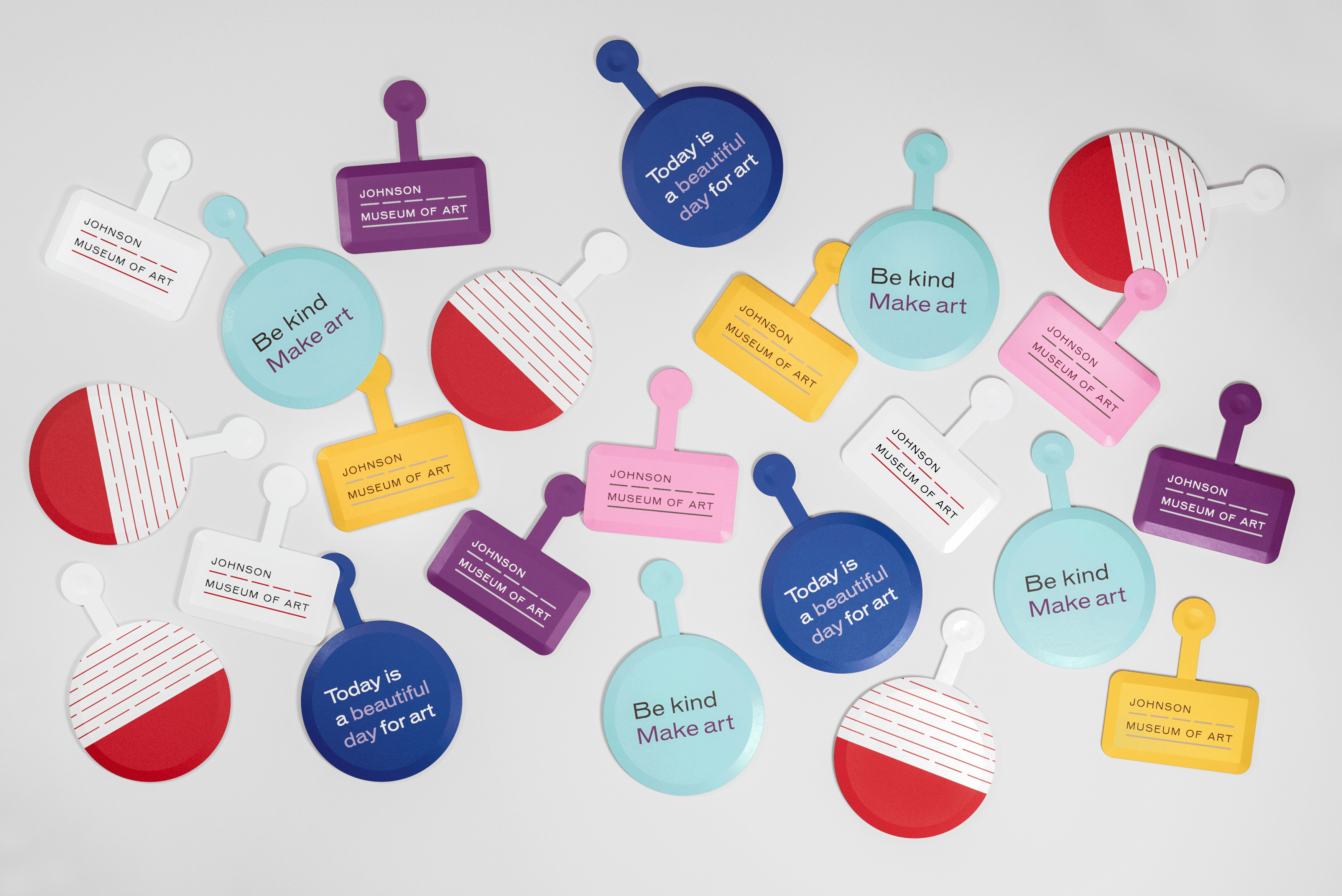
The Johnson Museum’s new visual identity responds to I.M. Pei’s architecture, an emblem of mid-century American modernism. The visual system is inspired by the building’s iconic panoramic window, which becomes a dashed line frame that connects the entire visual identity—spanning print, signage, web, and other digital applications. The distinctively wide typography and dynamic use of compositional space form an identity that is at once contemporary and timeless. To complement Cornell’s red and black color palette, we introduced a beige background color as a callback to the museum building’s iconic concrete, as well as numerous secondary color combinations. When this integrated system frames images of artworks or museum activities, it communicates the diversity and wide timespan of the museum’s offerings.
A university art museum embraces the digital age
The Johnson Museum’s new website represents a historic milestone for the institution—the first such redesign in over a decade. One of the museum’s strategic priorities was to create a sense of belonging for visitors from all walks of life, particularly those who may feel excluded or alienated by academia. While the new visual identity and website continue to emphasize Cornell as one of the world’s foremost research universities, they also amplify the museum’s teaching mission by creating resources for visitors of all ages and backgrounds. The Johnson Kids section translates artworks into a digital coloring book, 3D models, and other interactives that engage a multitude of learning styles. The Community Exhibition Creator gives the public the opportunity to build their own exhibits with artworks from the museum’s collections, including opportunities to add their own annotations, zoom in on details, and compare artworks side-by-side. Visitors are empowered to engage with the collection on their own terms, creating a more egalitarian and inclusive experience of the museum.


