Hey Barista by Oatly
Visual Identity, Website
Online storytelling platform for the popular oat milk company to highlight the barista community
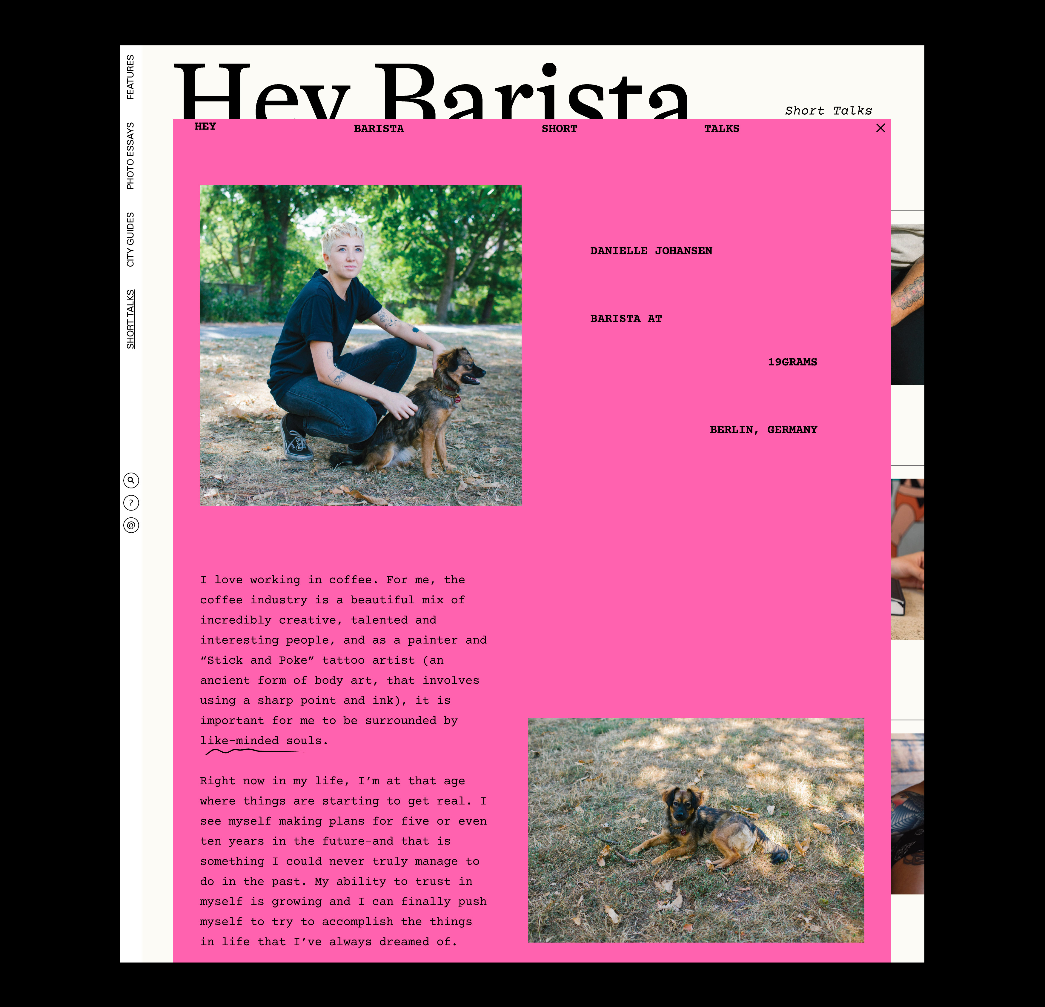
A platform for barista stories, dreams, and self-expression
Visit the live website: hey-barista.com
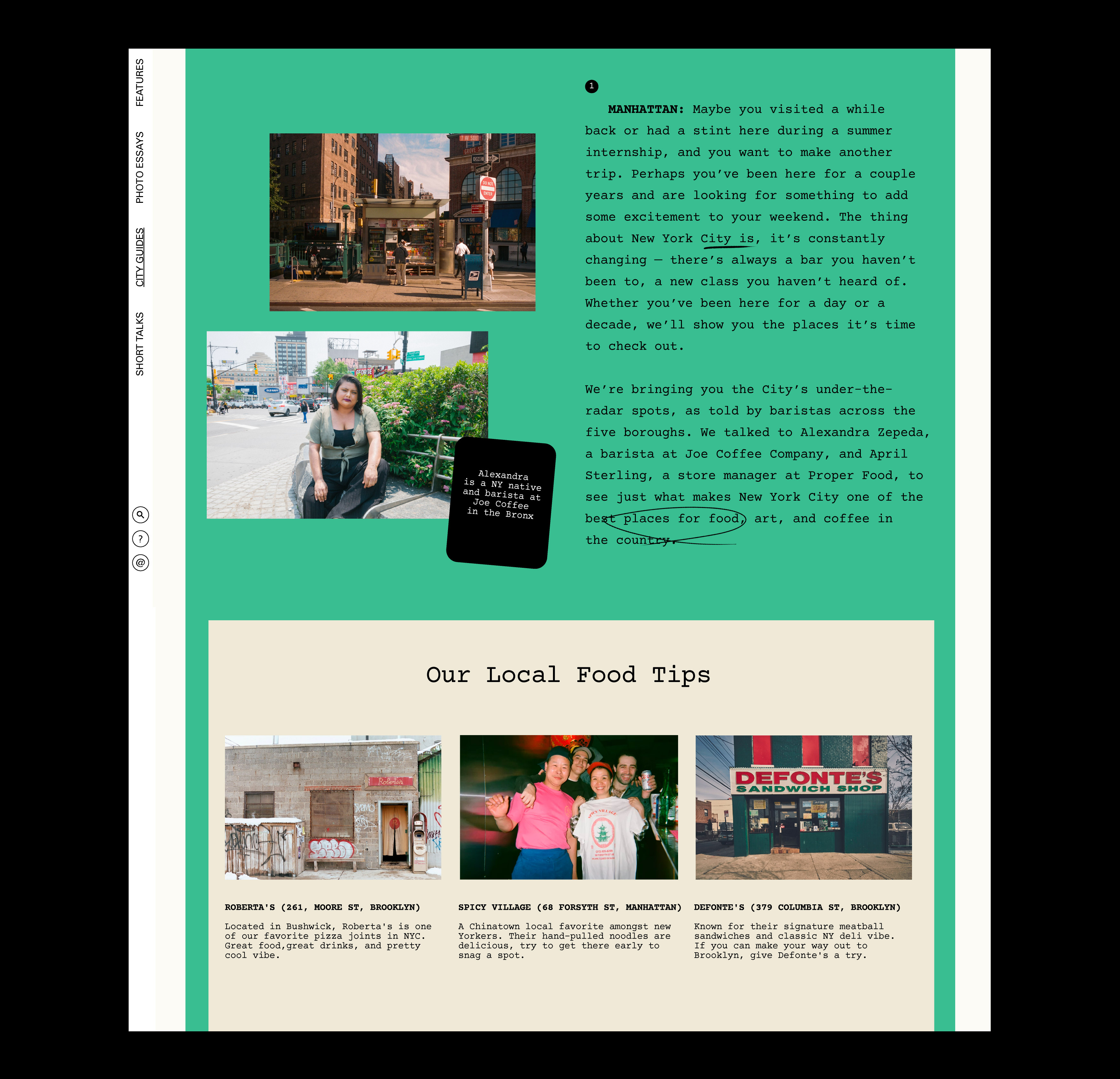
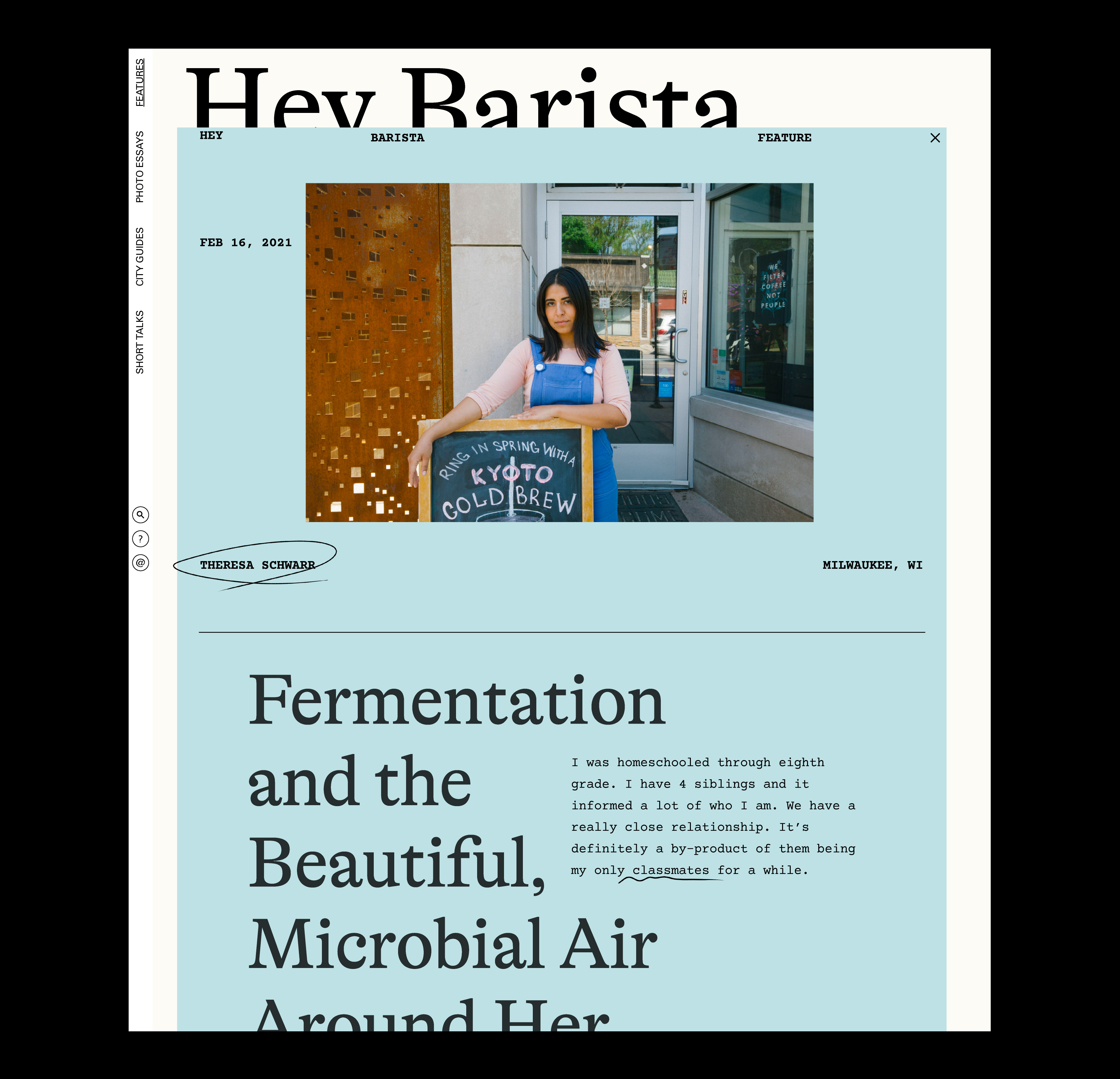
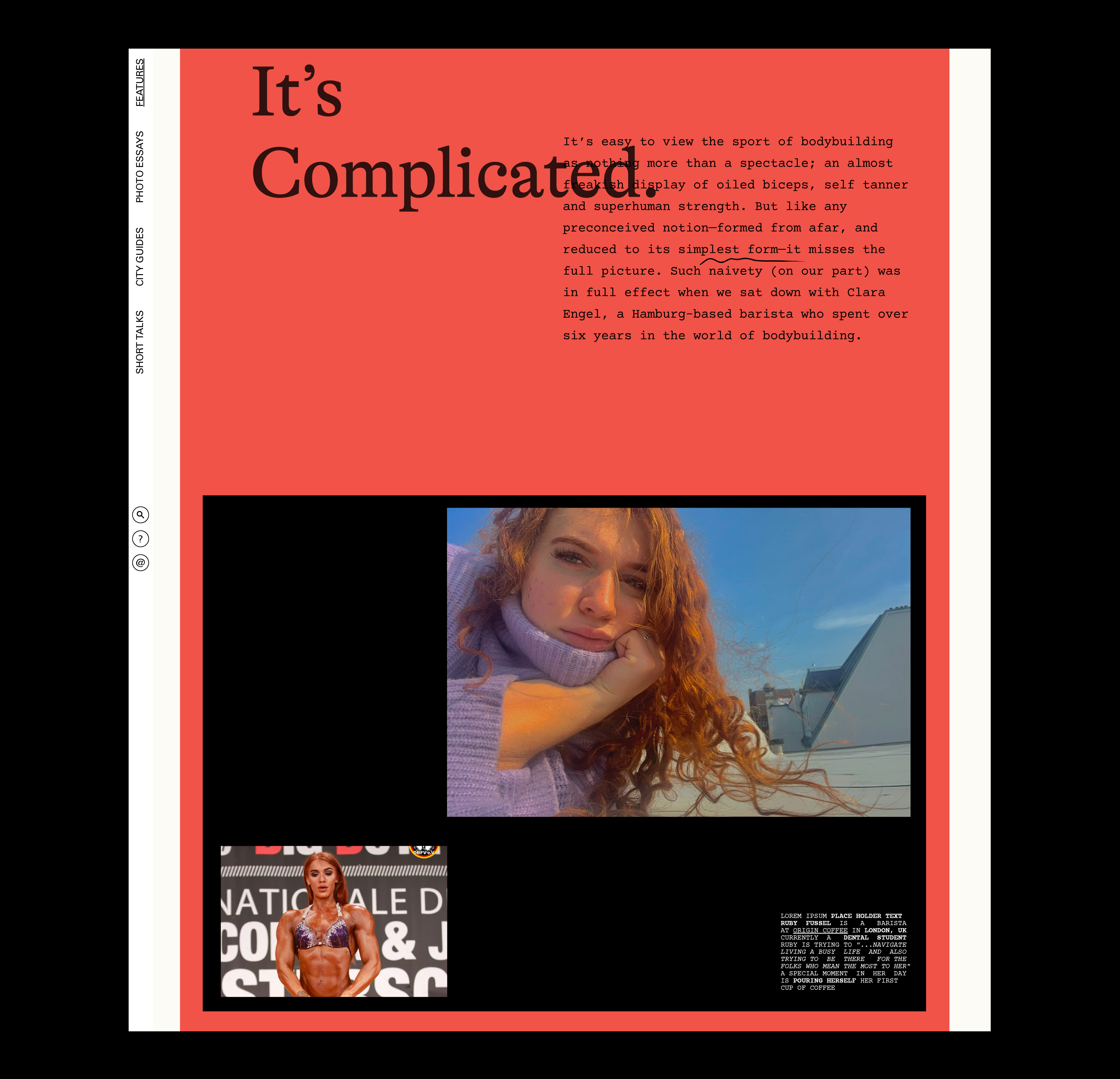
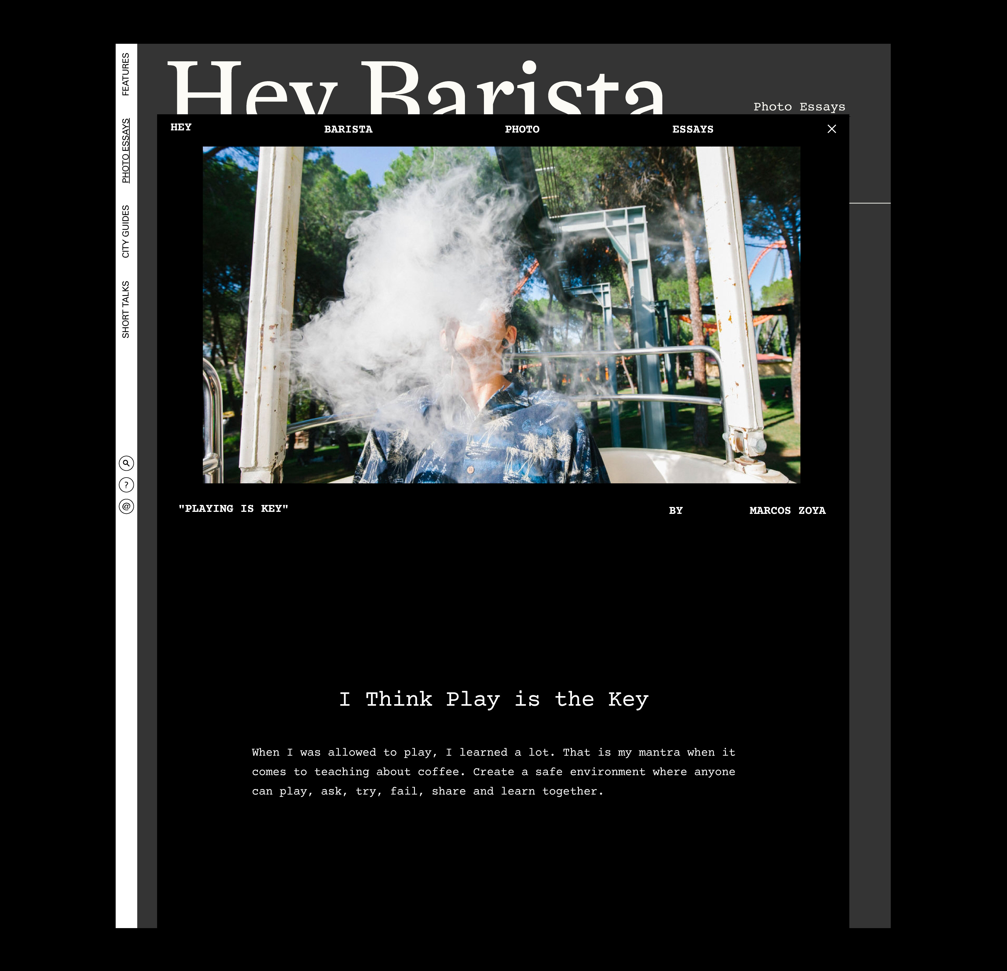
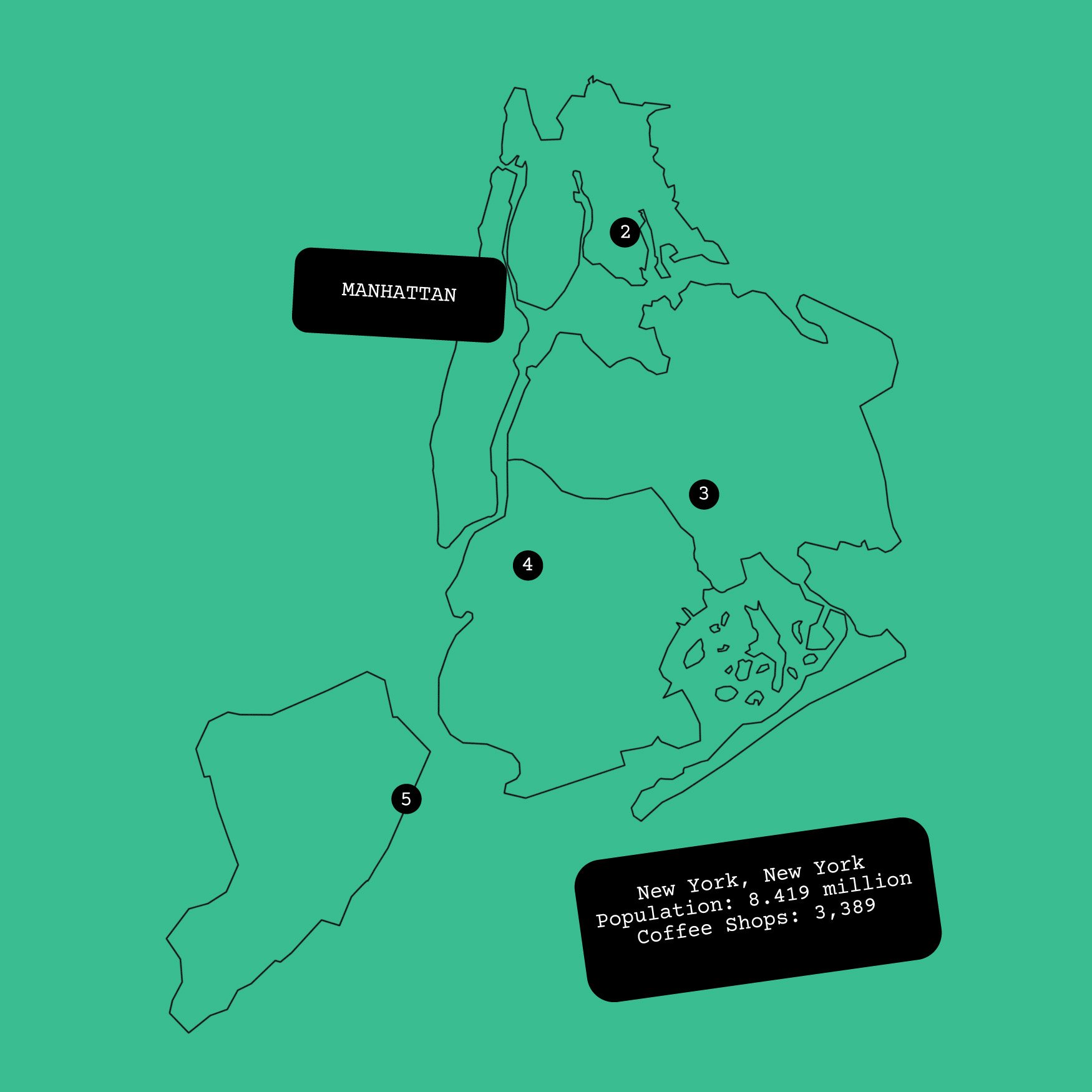
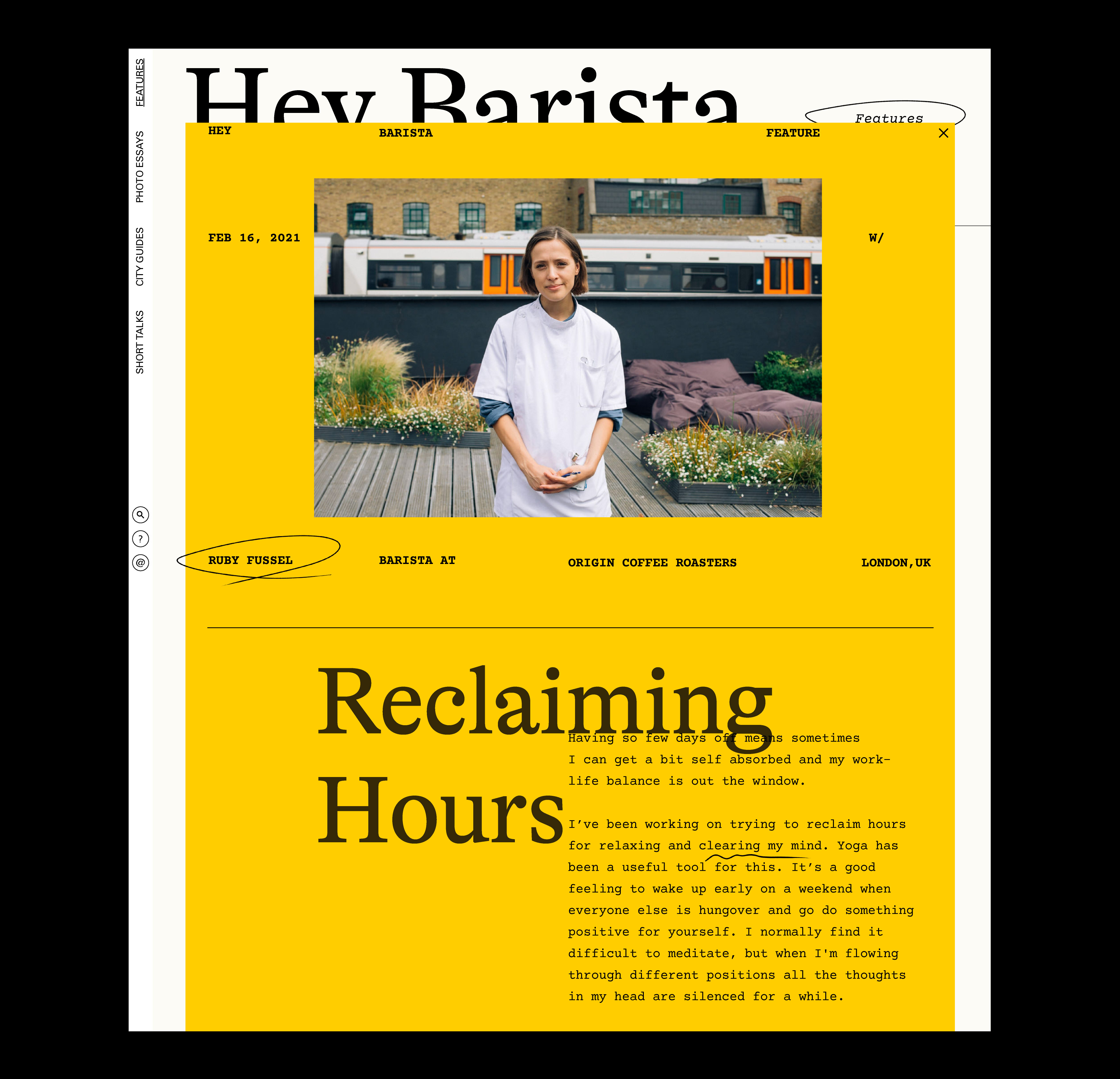
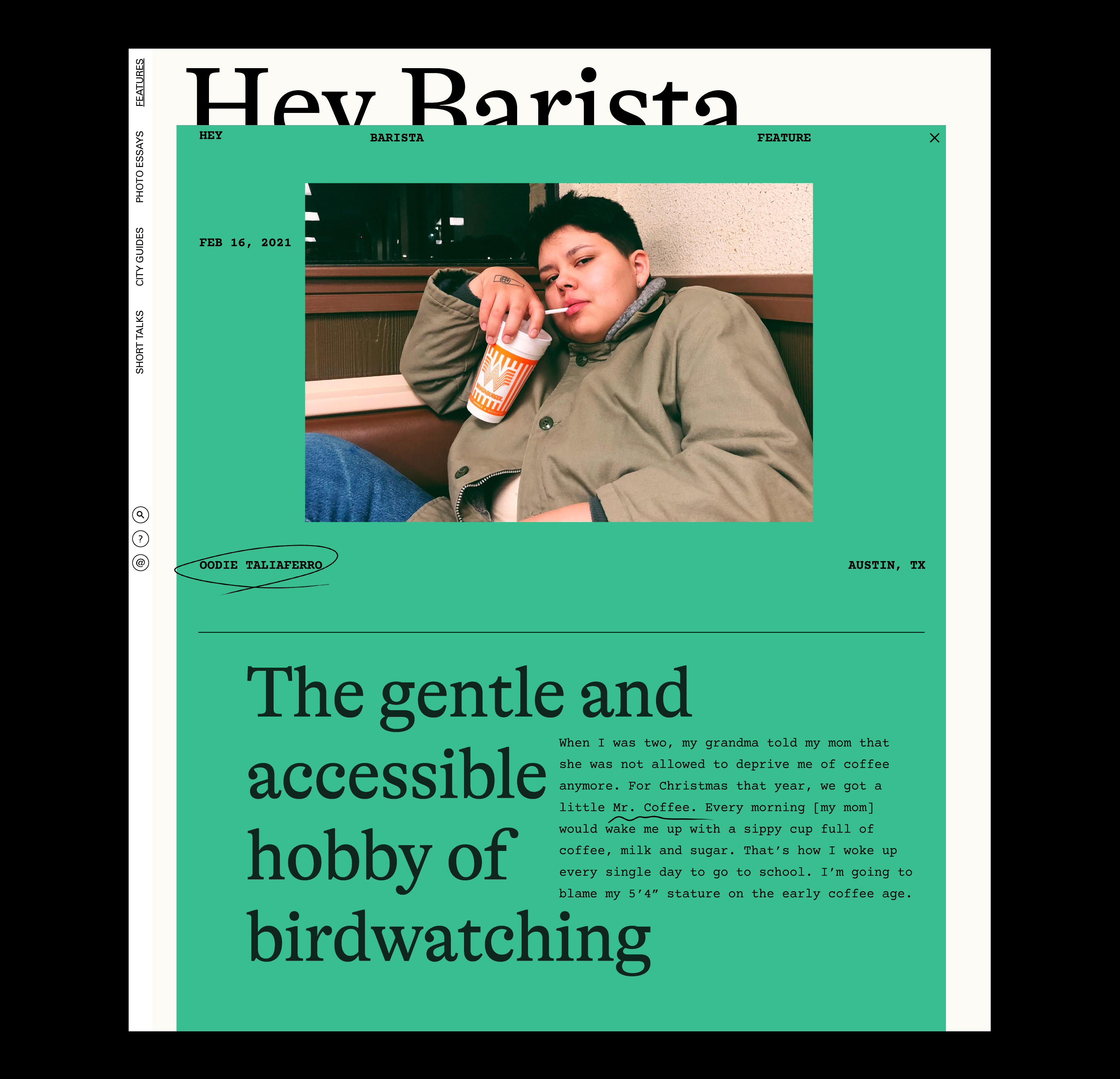
Isometric collaborated with the Swedish oat milk company Oatly to design Hey Barista, an online publishing platform that highlights musings, art, and ideas from the barista community. Through short talks, city guides, photo essays, and long-form stories, the website is a love letter to baristas and a window into their lives beyond the coffee counter. The design invokes the quirky, lighthearted feel of the Oatly brand but also features poignant stories with intimacy and dignity. It reformulates powerful elements from print magazines—crisp typography, hand-drawn marks, and unconventional compositional techniques—for the web, drawing readers into a more localized and sustainable way of looking at the world.
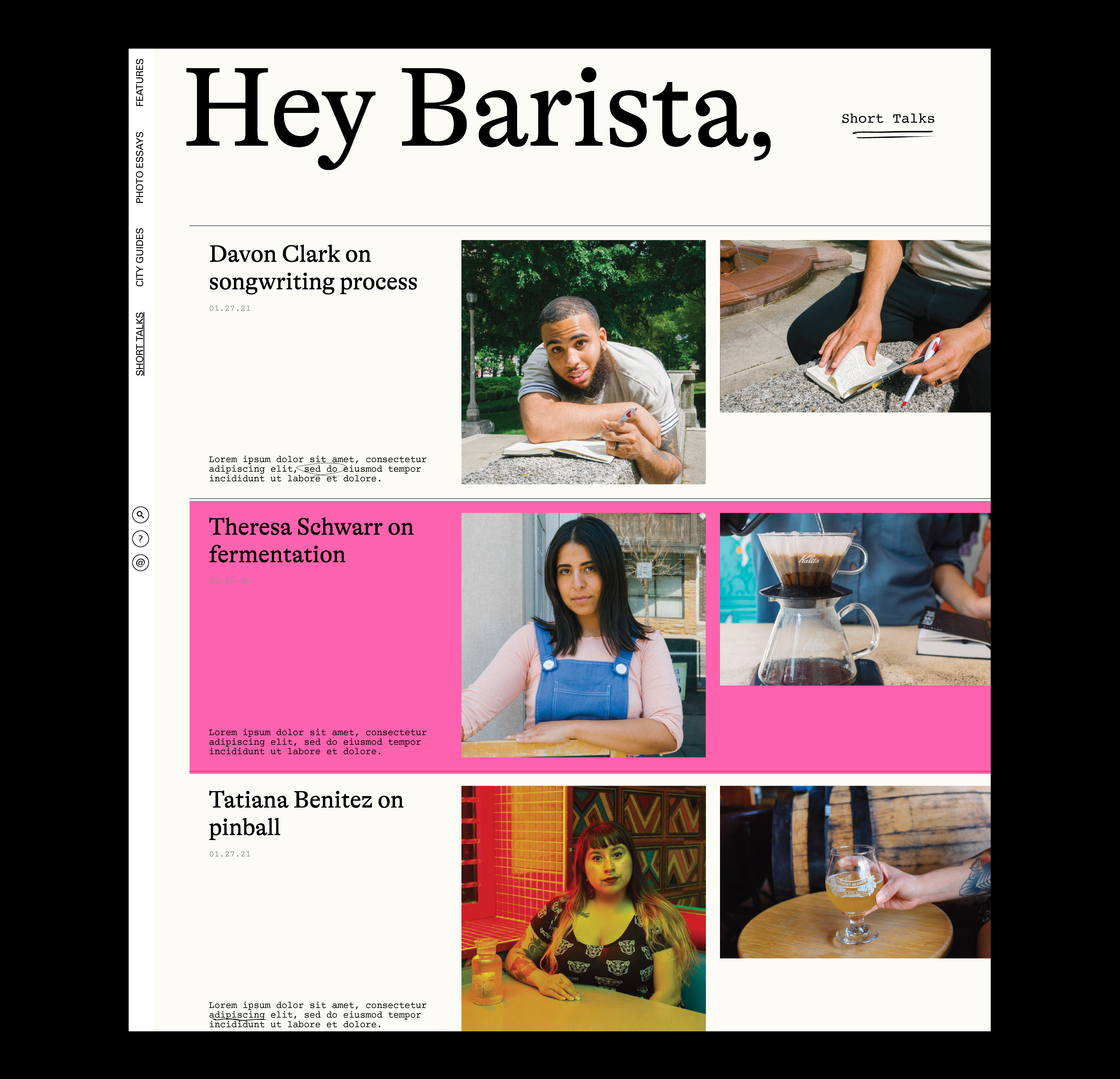
Intimate stories with wide-ranging impact
A theme that runs through the various essays, short talks, and city guides is how we can take better care of ourselves and our planet, including the beautiful animals and vegetation that surround us. The stories have an intimacy to them because they deal with personal obsessions and routines that are deeply situated in a sense of place. What emerges is a series of accounts revealing the dreams, ideas, and aspirations of baristas, whether they are in it for good or are working hard to pursue other passions while supporting themselves financially through serving coffee.
