Bent On Learning
Visual Identity, Website, Publication
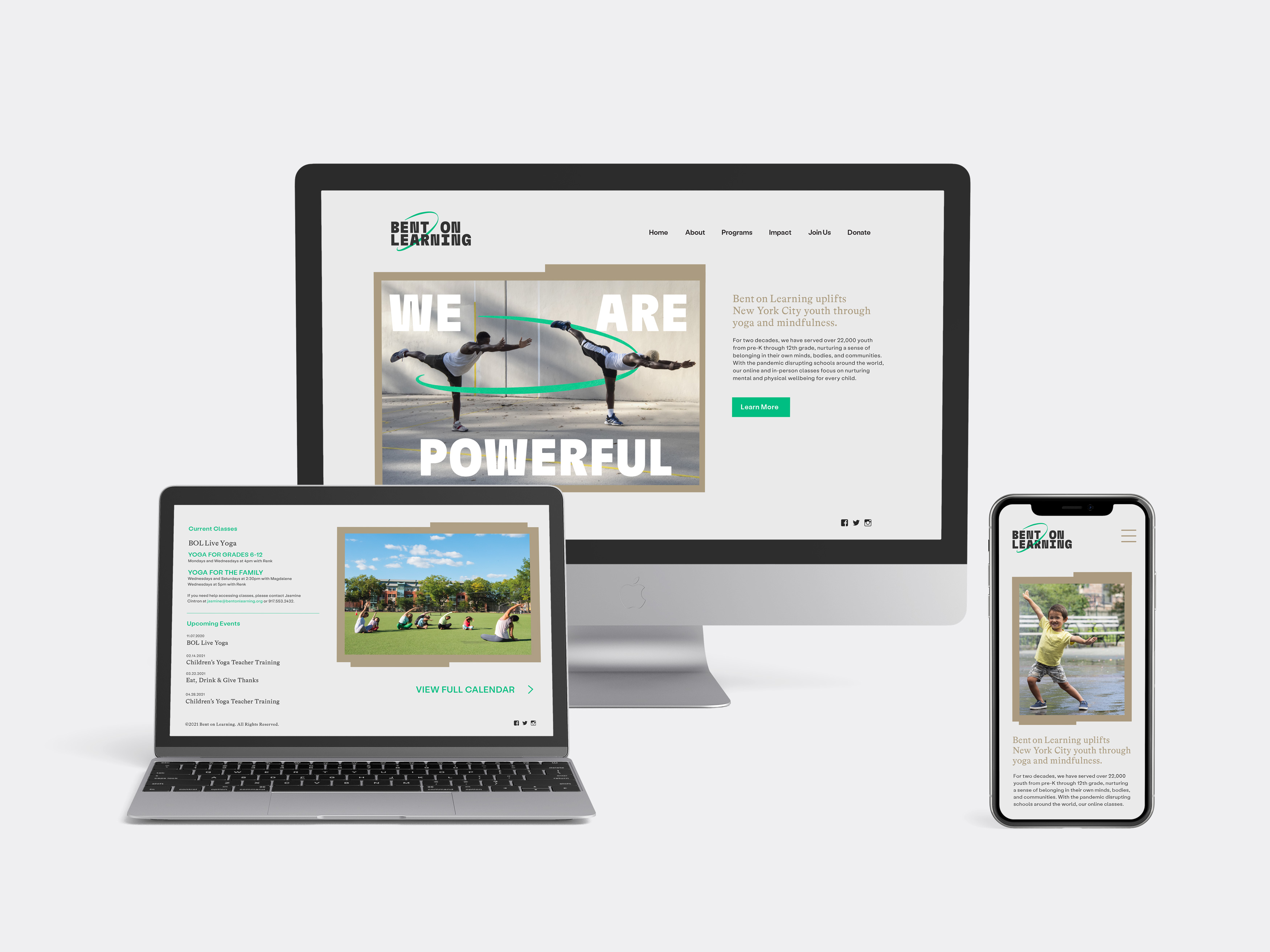
Brand identity, marketing materials, and website for the nationally recognized nonprofit that uplifts youth through yoga
Envisioning yoga for a new generation
Bent On Learning, was founded in the aftermath of 9/11, when three volunteer youth yoga teachers were invited to teach yoga as a tool for stress management in schools impacted by the attacks. Since then, they have reached over 22,000 youth in New York City schools with yoga and mindfulness education. In designing BOL’s new brand identity, Isometric created powerful, grounded typography that expresses the vibrant energy of the city. The blocky letters are complemented by an animated ribbon motif and soothing colors that convey healing and transcendence. This play of opposites respects yoga’s spiritual dimensions while expanding access to urban youth, resulting in an uplifting and empowering new identity.

New platforms for community healing
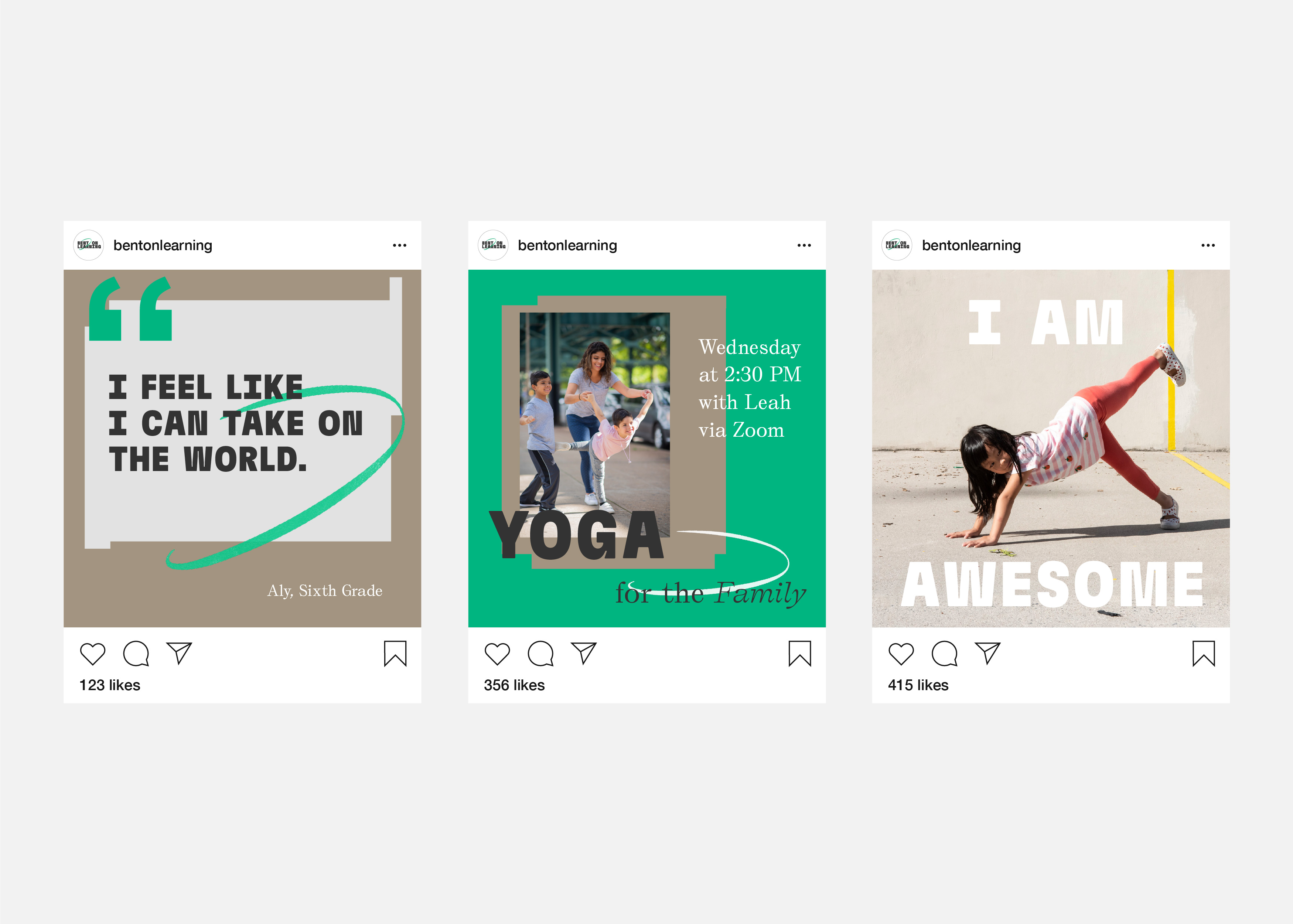
With the COVID-19 pandemic disrupting schools around the world, Bent On Learning adopted a new engagement model that leveraged virtual and at-home classes that focus on nurturing physical and mental well-being for every child. To visualize the transformative power of BOL’s work, Isometric conducted custom photography with youth, parents, and BOL instructors who represent diverse constituencies. We then created a comprehensive marketing website, physical collateral, and social media assets to amplify BOL’s expansive new offerings.


