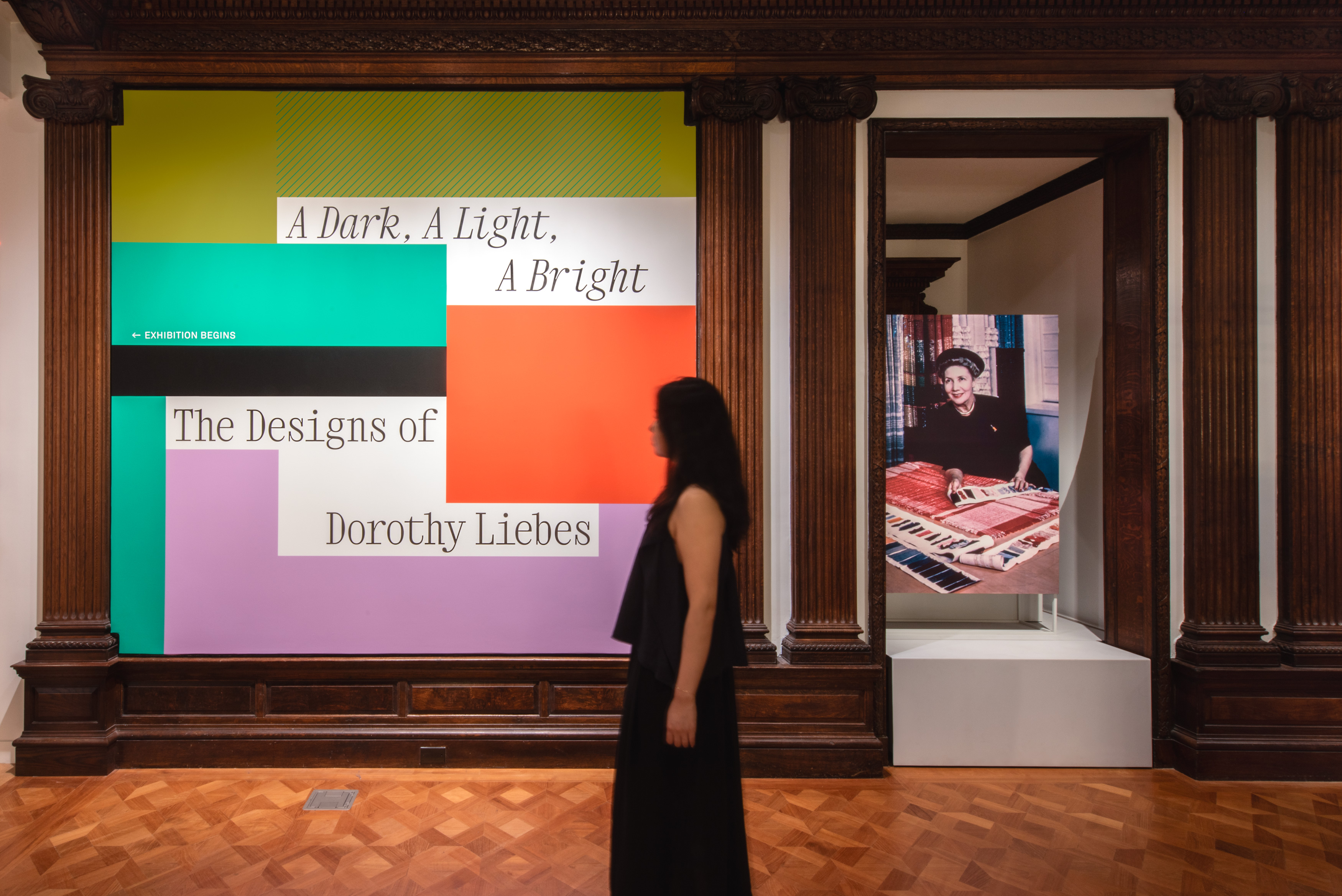
A Dark, A Light, A Bright: The Designs of Dorothy Liebes
Visual Identity, Exhibition, Architecture
Exhibition design for a major retrospective on the renowned textile designer at Cooper Hewitt, Smithsonian Design Museum

Celebrating an icon of American modernism
Isometric designed the first monographic exhibition in 50 years dedicated to Dorothy Liebes, the esteemed textile designer whose contributions shaped 20th century American modernism. The exhibition spans the Cooper Hewitt, Smithsonian Design Museum’s entire 6000 sq. ft. second floor, contextualizing Liebes’ staggering impact in an immersive survey of her studio’s body of work—including over 175 textiles, furniture pieces, documents, and photographs. The exhibition architecture unifies the museum’s diverse configuration of galleries through loom-inspired thresholds and display platforms composed of ash wood and tensioned green cord. Monumental casework further recalls Liebes’ studio by abstracting the work table. The visual language is effusive and dynamic with color blocks and diagonal line patterns that evoke Liebes’ sensibility in supergraphic form.
Exhibition fabrication and installation by South Side Design & Building.
Photo: Matt Flynn © Smithsonian Institution
Photo: Elliot Goldstein © Smithsonian Institution
Restoring Liebes’ rightful place in history
A collaborator of Frank Lloyd Wright and Raymond Loewy, Dorothy Liebes adorned grayish buildings designed by men with fabrics of unparalleled color and shimmer. Though she was celebrated in her lifetime, interest in Liebes’ work waned after her death—a consequence in part of the inability of black-and-white photography to capture the resplendent intensity of her designs and their revolutionary use of materials. The exhibition restores Liebes’ place in history by juxtaposing photographs with their respective original objects. The design is spacious and sophisticated, yet unabashedly colorful and effervescent—a tribute to Liebes’ belief that high design should be popularly accessible.
Photo: Elliot Goldstein © Smithsonian Institution
Photo: Elliot Goldstein © Smithsonian Institution
Photo: Elliot Goldstein © Smithsonian Institution
“I can’t tell you how many people have said the second floor is utterly transformed—including people with a long history with the building. The exhibition design is effective, beautiful, and well-crafted. It really does everything I hoped, showcasing the textiles and contextualizing them in an immersive world.”
Photo: Elliot Goldstein © Smithsonian Institution
Photo: Elliot Goldstein © Smithsonian Institution
Channeling Liebes’ limitless imagination
Designing in the architectural context of the Cooper Hewitt’s historic landmark building is an exercise in turning constraints into opportunities. Exhibition architecture newly introduced into the space cannot be attached to the historic wood floor or walls. Most objects are required to be presented in existing, impermeable glass vitrines, backed by exhibition walls, or in archival casework with inert materials. We collaborated with the museum team to develop bespoke design solutions for each scenario, including a new label system that is minimalist and sleek, yet optimized for accessible reading. The trenchant, contemporary design stands both in contrast to and synthesis with the architectural context—a nod to Liebes’ syncretic design philosophy.
Photo: Matt Flynn © Smithsonian Institution


