Lindens
Visual Identity, Signage, Illustration
Visual identity, signage, and illustrations for modern American restaurant celebrating seasonality at Arlo SoHo

Celebrating nature and seasonality in the city
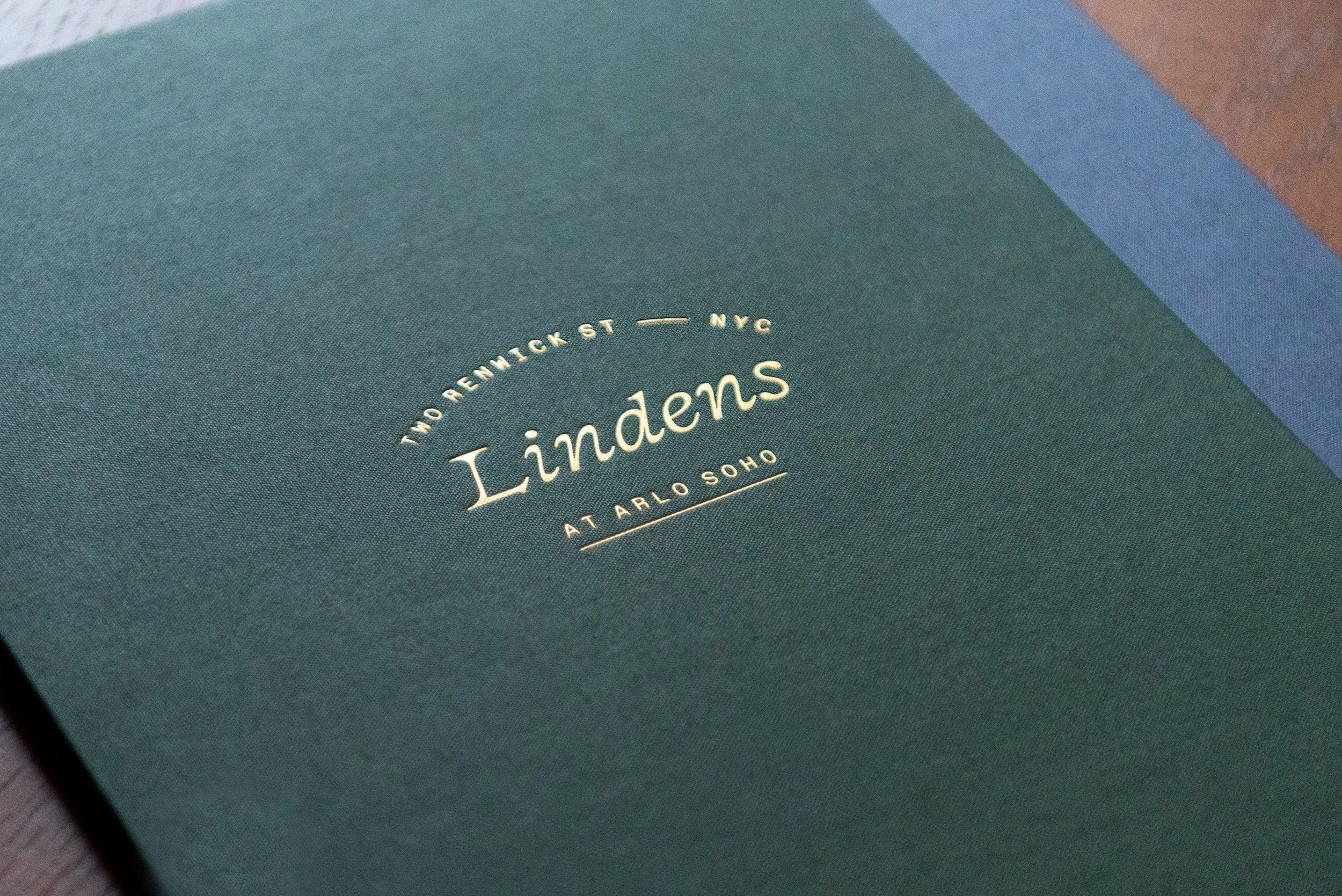
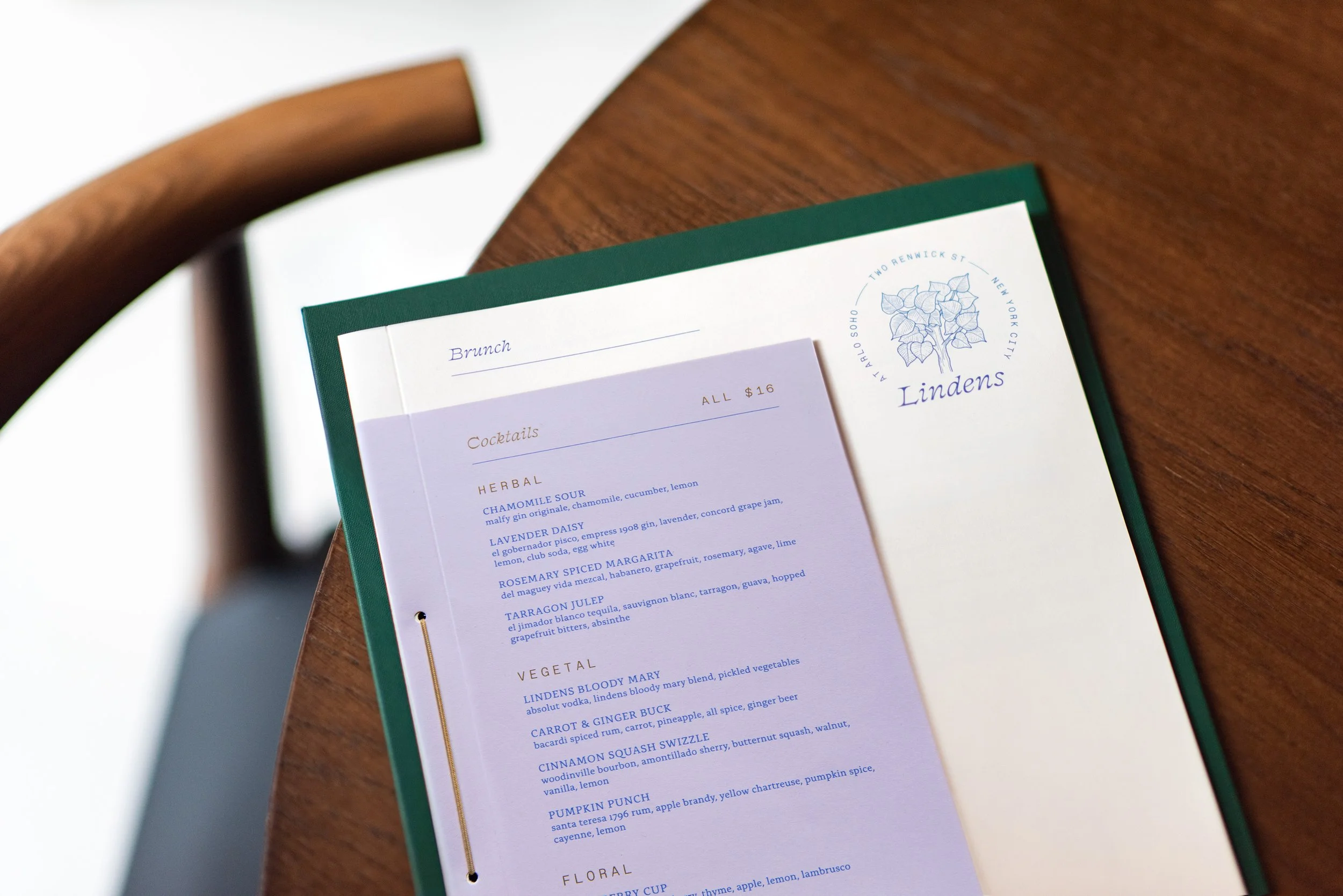
Isometric designed the visual identity, collateral, and signage program for Lindens, a modern American restaurant at Arlo SoHo. Inspired by the trees that line New York streets, Lindens is an ode to nature within the city. The restaurant features the finest local ingredients and producers, celebrating the essential tastes and flavors of each season. The visual identity makes use of elegant, custom typography complemented by richly-detailed and humorous illustrations, evoking the linden tree’s mythical significance. The design underscores a neighborly and welcoming sensibility, while also emphasizing culinary excellence.
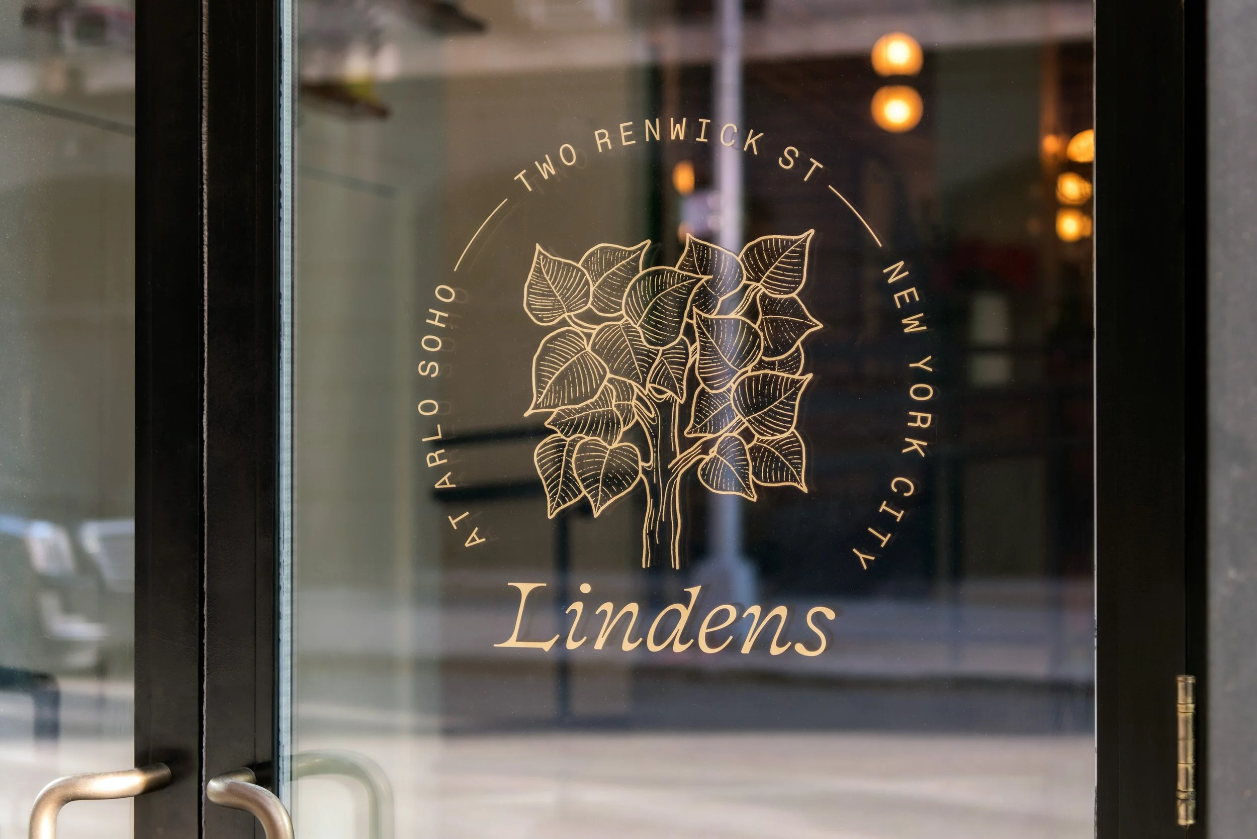
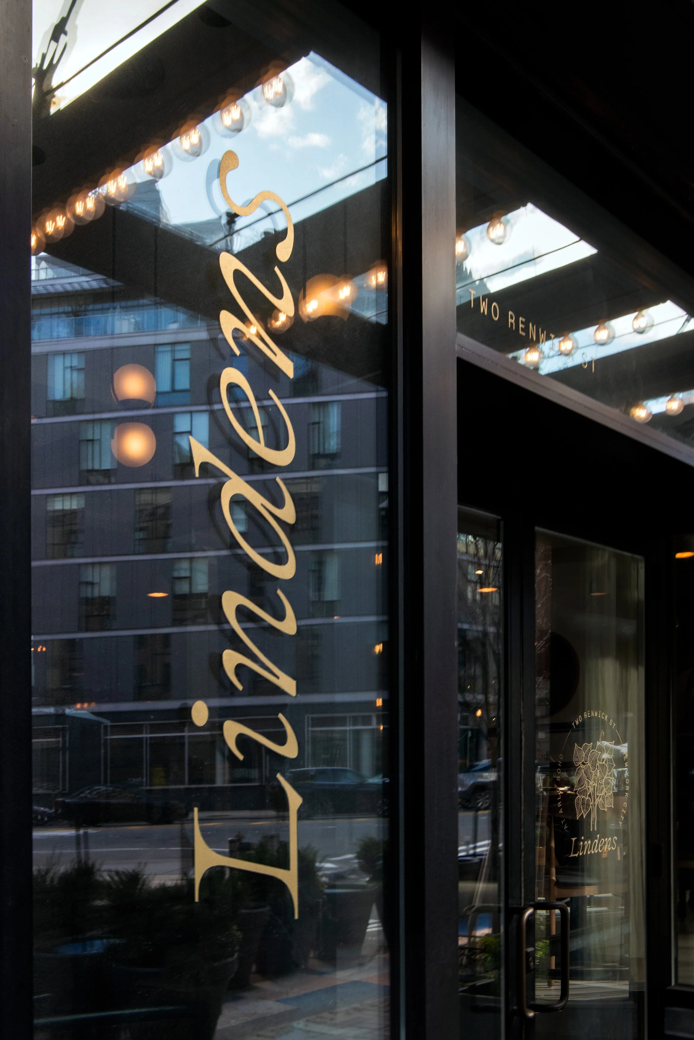
Window gilding and signage fabrication by Noble Signs.

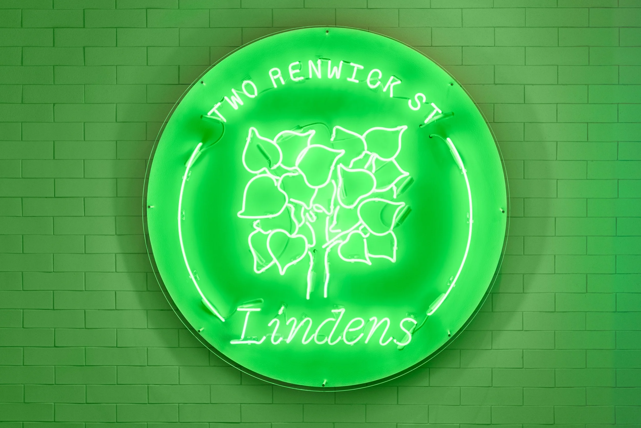
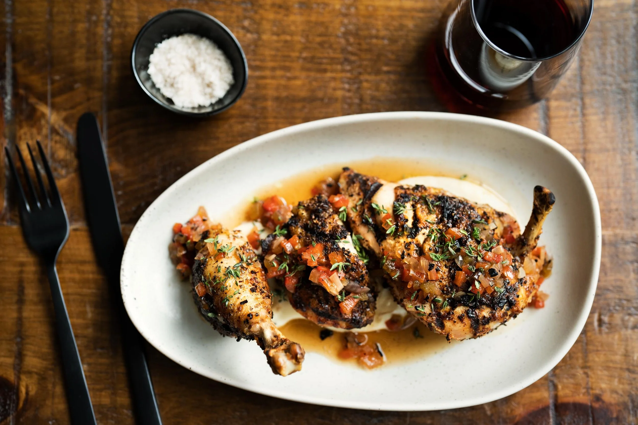
Photo by Emily Andrews.
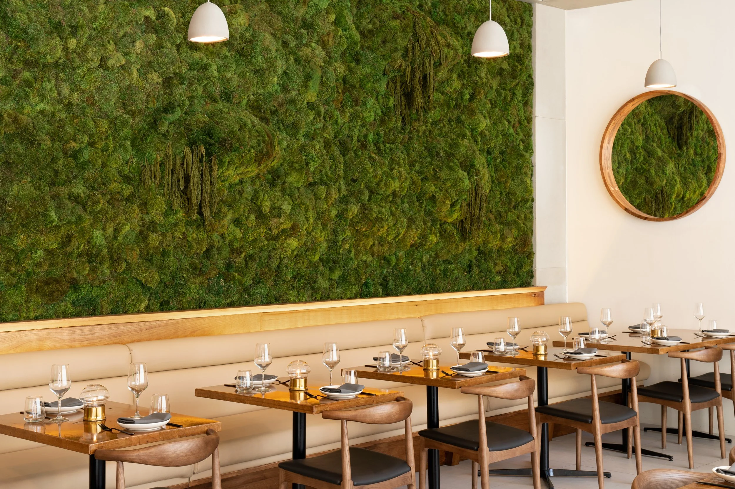
Photo by Emily Andrews.
Playful placemaking and elegant typography
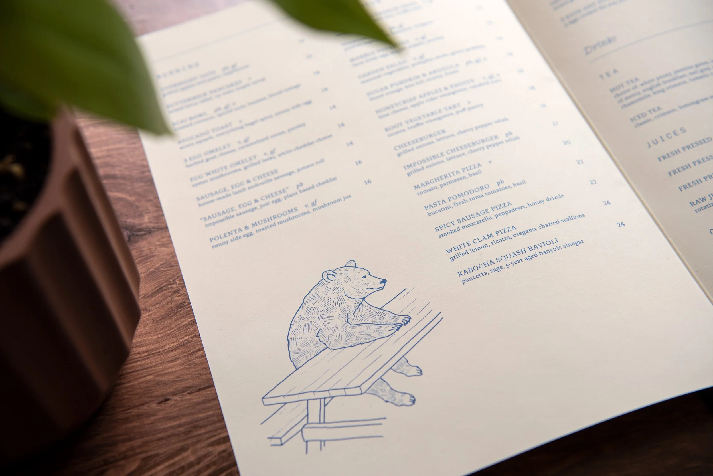
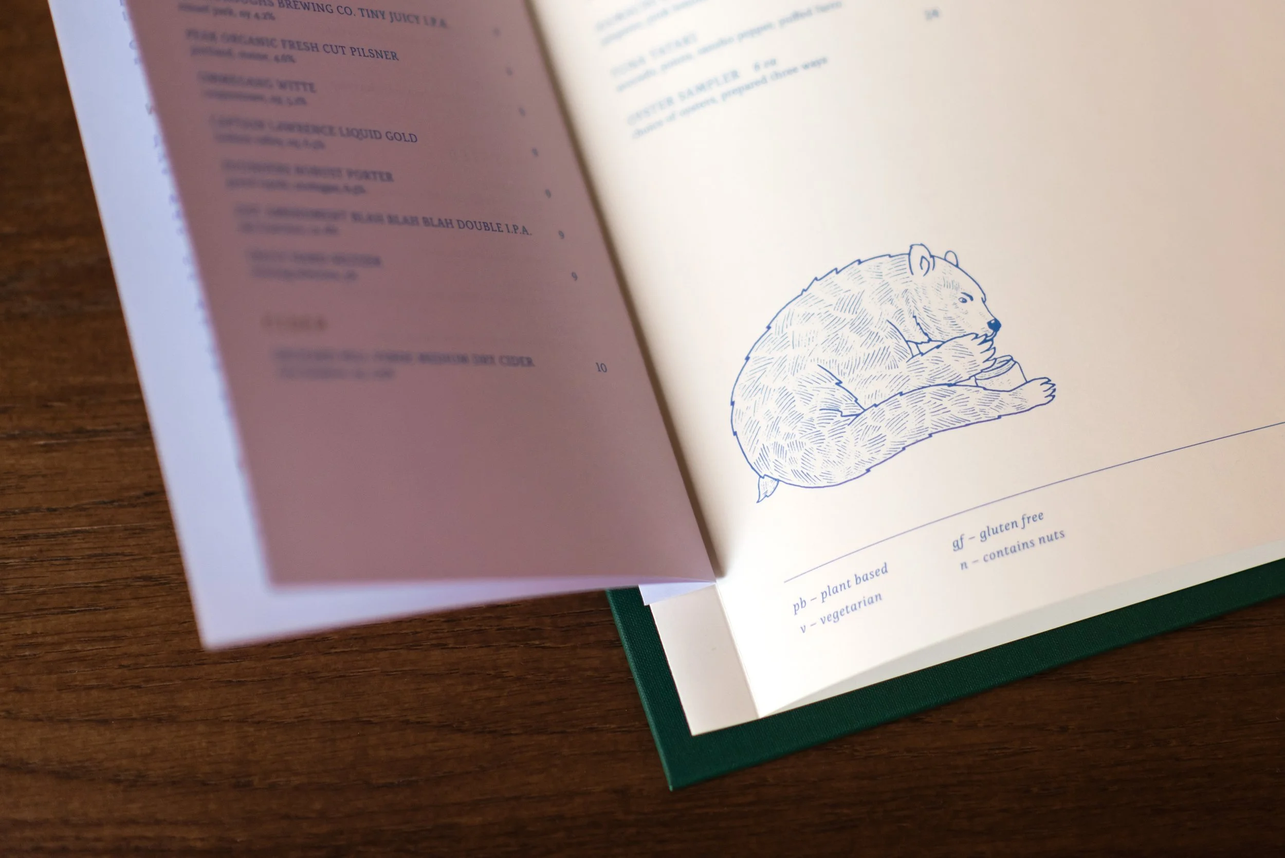
Isometric’s design for Lindens pairs elegant, swash typography with playful bear illustrations, evoking an organic, woodland respite from the intensity of city life. The principal typeface, Clifton Italic, has been customized to soften its edges, improving readability and creating a more welcoming sensibility. For the principal mark, Isometric adapted folkloric illustrations of the Linden tree, a symbol of communal gathering and festivity. Among other woodland creatures, bears live in larger linden trees. The design responds to this fun fact by incorporating bear illustrations that infuse the materials with wit and joy.

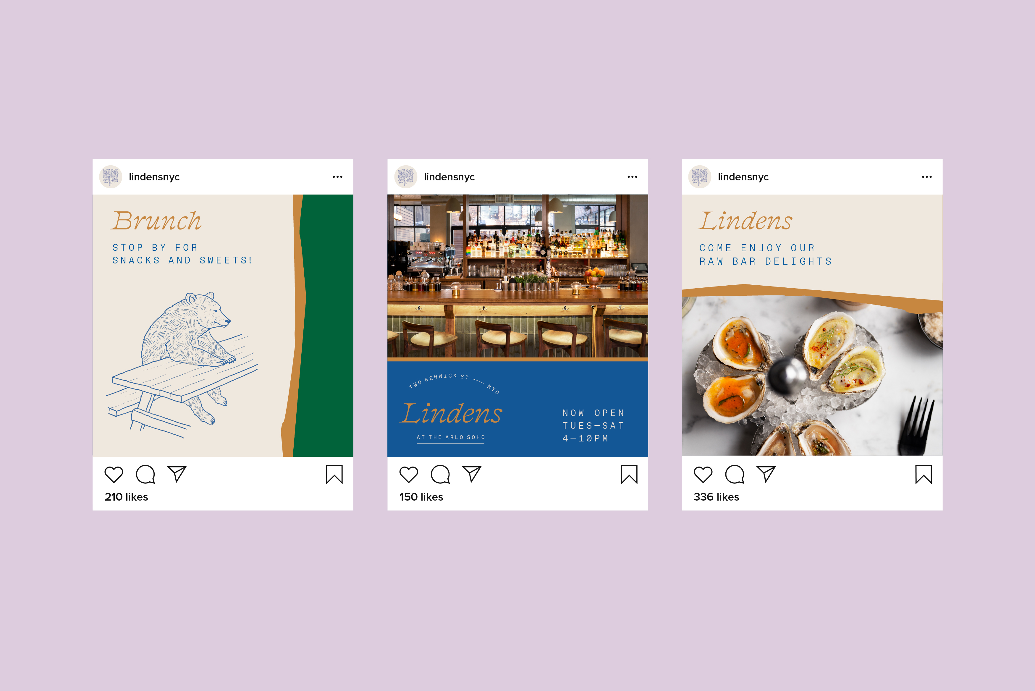
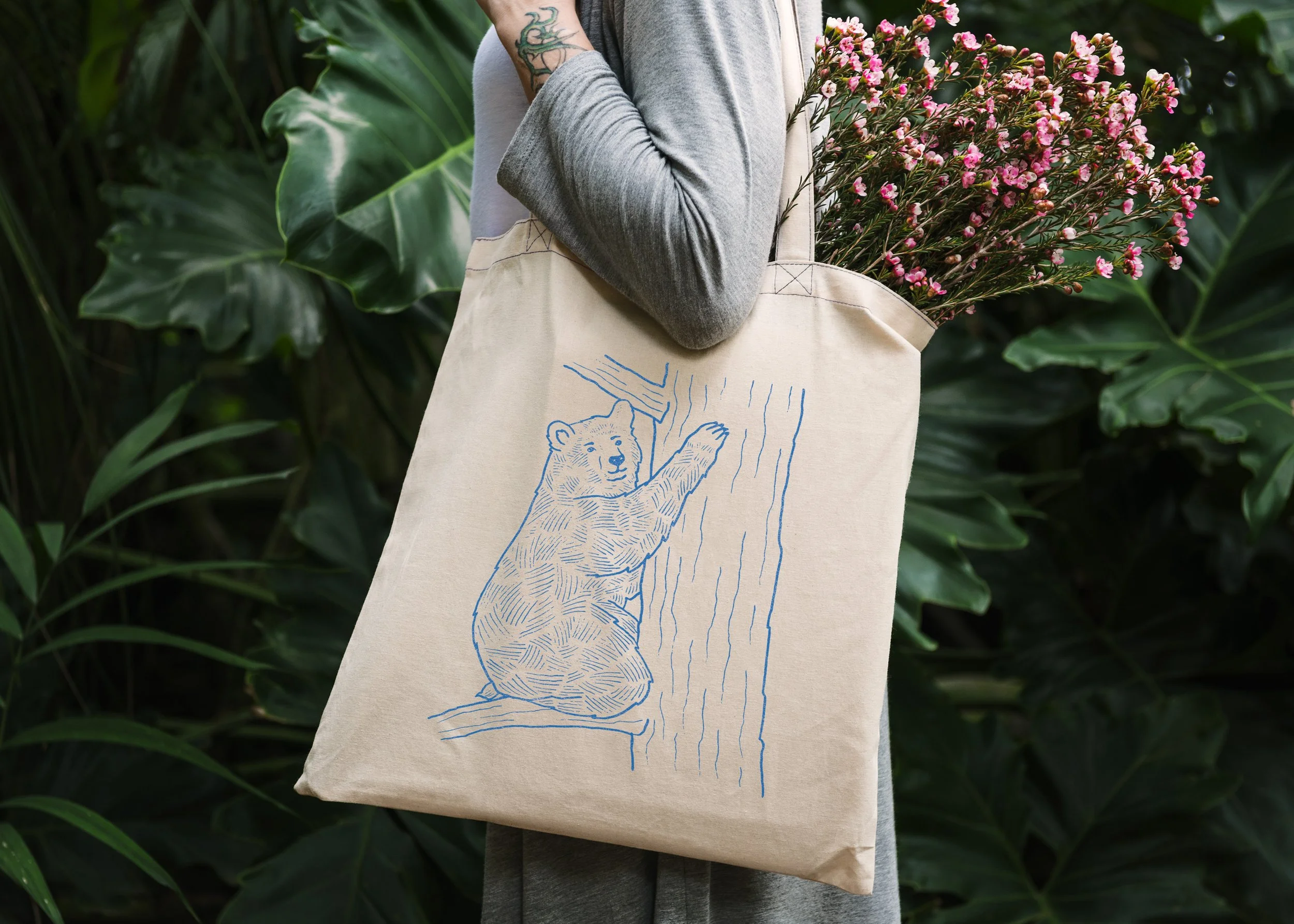
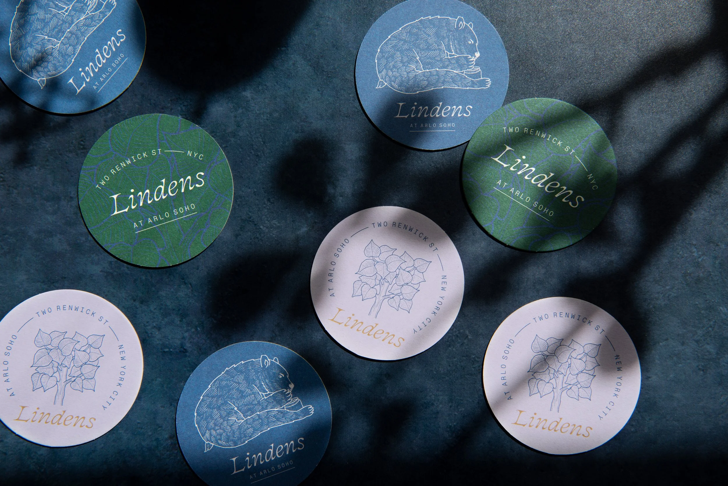

Photo by Emily Andrews.